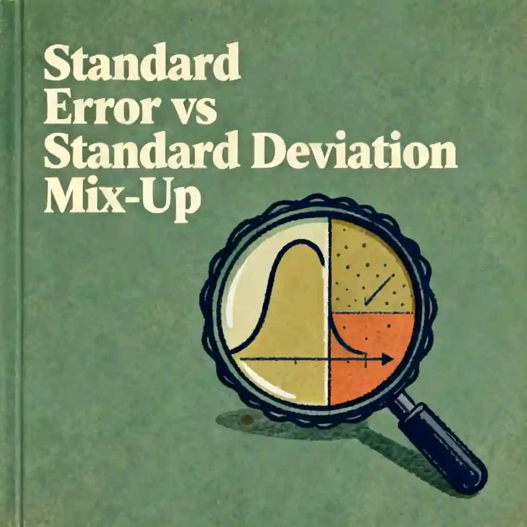
Standard Error vs. Standard Deviation: The Common Mix-Up最佳语录
Standard deviation describes the 'texture' of your data—how spread out individual points are—while standard error measures the 'wobble' of your average, telling you how much you can trust your estimate.
此音频课程由 BeFreed 社区成员创建
Difference between standard error and standard deviation


常见问题
In this context, "texture" refers to the standard deviation, which describes the inherent spread or "wildness" of individual data points, such as the variety of scores in a classroom. "Wobble" refers to the standard error, which measures the reliability or uncertainty of the calculated average. While standard deviation describes the system itself, standard error describes the precision of the researcher's estimate.
Error bars typically represent the standard error, which is calculated by dividing the standard deviation by the square root of the sample size (n). As the sample size increases, the "wobble" or uncertainty of the mean decreases, making the average feel more "rock-solid." However, this does not mean the actual data has become more consistent; the underlying standard deviation or "texture" of the system remains the same regardless of how many samples are taken.
Because the sample size (n) is under a square root in the standard error formula, there are diminishing returns on precision. To cut the standard error or "uncertainty" in half, a researcher must quadruple the sample size rather than just doubling it. This mathematical reality makes high-precision research expensive, as obtaining a slightly smaller margin of error requires a massive increase in data collection.
Yes, because statistical significance is driven by the standard error. With a large enough sample size, even a tiny difference in averages can become statistically significant. However, if the standard deviation (the real-world variability) remains high, that tiny difference might be invisible to the end-user. For example, a one-millisecond improvement in app speed might be statistically "real," but if the individual user experience varies by fifty milliseconds, the improvement has no practical impact.
A helpful gut check is that the standard error will almost always be smaller than the standard deviation. If the error bars on a chart look suspiciously tiny compared to the spread of the data, they are likely showing the standard error (the precision of the mean) rather than the standard deviation (the variety of individual experiences). Clear labeling is essential, as using the standard error as a "plus or minus" without a label can misleadingly make a noisy system look stable.
发现更多

Master thinking in distributions
In an increasingly complex world, the ability to quantify uncertainty is a superpower for leaders and analysts. This plan bridges the gap between raw statistics and practical decision-making for anyone looking to master risk.

Master Probability in Life, Work & Business
In an increasingly unpredictable world, the ability to quantify risk and think statistically is a critical competitive advantage. This plan is designed for professionals and decision-makers who want to replace guesswork with data-driven confidence and sharper mental models.

Learn The Misbehavior of Markets tenets
Modern finance often relies on outdated models that ignore the reality of extreme market events. This plan is essential for investors and analysts who want to move beyond standard deviations to understand the true nature of risk and fractal patterns in financial systems.

Study Nate Silver's statistical methods
In an era of data overload, the ability to filter out noise is a critical competitive advantage. This plan is ideal for data analysts, political junkies, and sports bettors who want to adopt the rigorous, Bayesian-inspired framework that made Nate Silver a household name.

become a data scientist
This comprehensive plan bridges the gap between theoretical statistics and practical production-level engineering. It is ideal for aspiring data scientists and analysts looking to transition into high-impact roles by mastering the full lifecycle of data-driven decision making.

AI Decision Models: Constraints & Failures
As AI systems increasingly make consequential decisions in healthcare, finance, and public safety, understanding their limitations becomes critical. This plan equips professionals and decision-makers with the knowledge to evaluate AI systems realistically and build more reliable models that avoid common pitfalls.

Advance probability
This plan bridges the gap between basic chance and high-level statistical modeling. It is ideal for data scientists, analysts, and decision-makers looking to master uncertainty and predictive accuracy in professional environments.

Master Statistics for Data Analytics
This learning plan bridges the gap between theoretical math and practical business application, making it essential for aspiring data professionals. It is ideal for analysts and decision-makers who need to move beyond basic reporting to advanced predictive modeling and causal analysis.
"Instead of endless scrolling, I just hit play on BeFreed. It saves me so much time."
"I never knew where to start with nonfiction—BeFreed’s book lists turned into podcasts gave me a clear path."
"Perfect balance between learning and entertainment. Finished ‘Thinking, Fast and Slow’ on my commute this week."
"Crazy how much I learned while walking the dog. BeFreed = small habits → big gains."
"Reading used to feel like a chore. Now it’s just part of my lifestyle."
"Feels effortless compared to reading. I’ve finished 6 books this month already."
"BeFreed turned my guilty doomscrolling into something that feels productive and inspiring."
"BeFreed turned my commute into learning time. 20-min podcasts are perfect for finishing books I never had time for."
"BeFreed replaced my podcast queue. Imagine Spotify for books — that’s it. 🙌"
"It is great for me to learn something from the book without reading it."
"The themed book list podcasts help me connect ideas across authors—like a guided audio journey."
"Makes me feel smarter every time before going to work"