第 1 章
Beyond Numbers: How Data Tells the Stories of Our Lives
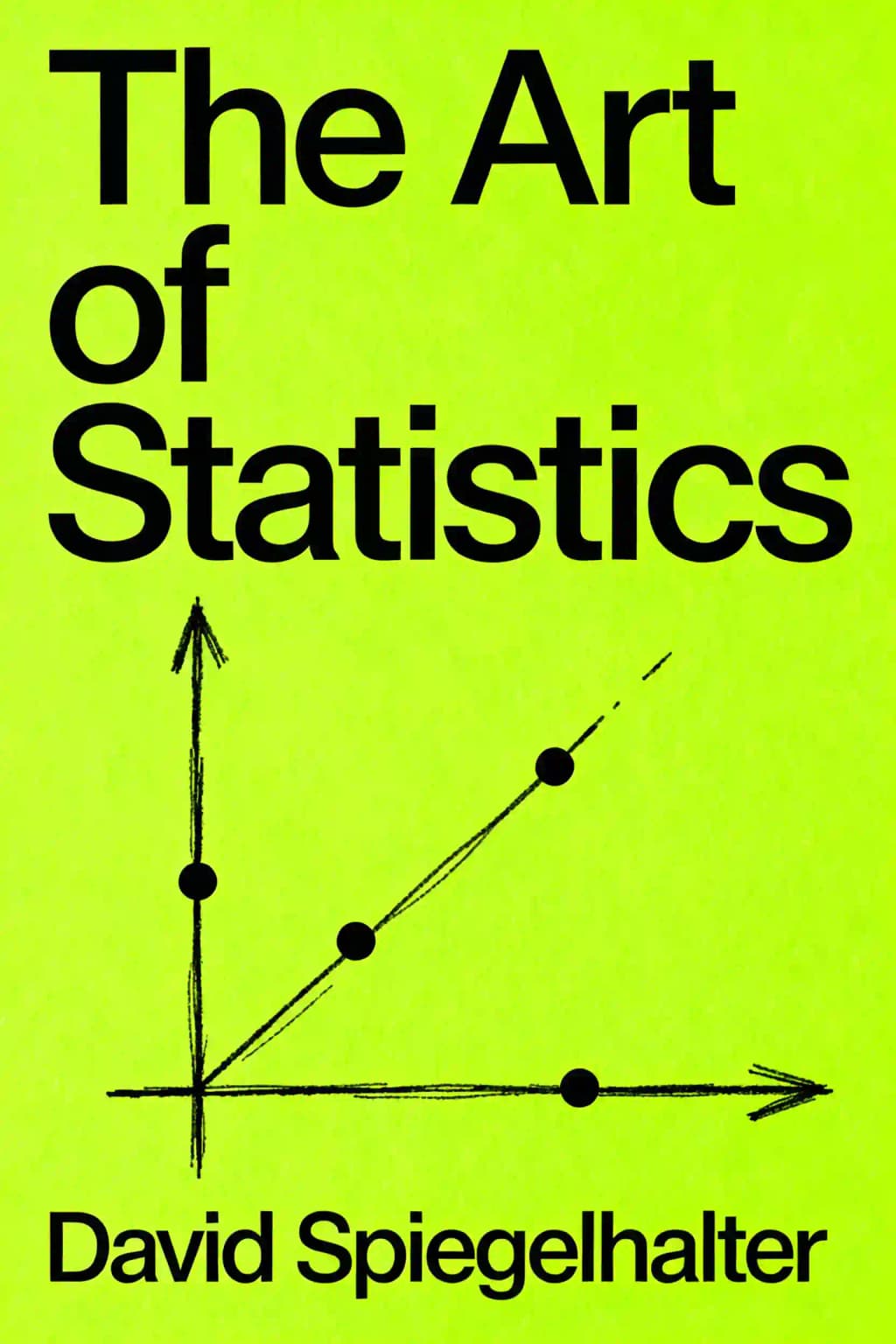
Statistics isn't just about formulas and p-values-it's about understanding our world through the lens of data. In David Spiegelhalter's "The Art of Statistics," we discover that statistics is fundamentally a human endeavor, concerned with extracting meaning from the chaos of information surrounding us. This groundbreaking book has become required reading in universities worldwide and was named one of Bill Gates' favorite books of 2019. Its popularity stems from Spiegelhalter's remarkable ability to make complex statistical concepts accessible without sacrificing intellectual depth. As The Guardian noted, it "should be required reading for all politicians, journalists, medics and anyone who tries to influence people." Through real-world examples-from murder investigations to heart surgeries, from Titanic survivors to the discovery of the Higgs boson-Spiegelhalter shows us how statistical thinking illuminates the hidden patterns in our everyday lives.
第 2 章
When Data Becomes Life or Death: The Bristol Heart Surgery Scandal
The Bristol Royal Infirmary tragedy reveals how statistics can literally be a matter of life and death. When little Joshua L. died during heart surgery, his parents weren't informed about concerns regarding the unit's poor survival rates-despite nurses quitting rather than face bereaved parents. The subsequent investigation found two surgeons and the hospital's chief executive guilty of serious professional misconduct.
The statistical team faced fundamental challenges in establishing basic facts: What counted as a "child"? What qualified as "heart surgery"? When should deaths be attributed to surgery? They settled on counting children under 16 who underwent open heart surgery, including deaths within 30 days regardless of location. Despite having multiple data sources, none could be considered the definitive truth.
The analysis revealed approximately 30 "excess deaths" at Bristol compared to the national average-a finding that transformed healthcare in Britain. This case demonstrates how presenting statistical information dramatically affects perception. When UK children's heart surgery outcomes are now publicly reported, they're framed as "survival rates" (averaging 98%) rather than "mortality rates" (2%)-identical information that creates vastly different emotional responses.
This framing effect appears everywhere. A London Underground advertisement claimed "99% of young Londoners do not commit serious youth violence"-reassuring until reframed as "10,000 seriously violent young people in London." Similarly, when the World Health Organization classified processed meat as a carcinogen, headlines screamed that bacon was as dangerous as cigarettes. The reality? Daily bacon consumption increases lifetime bowel cancer risk from 6% to 7%-a relative risk increase of 18% but an absolute risk increase of just 1%.
How we visualize data matters tremendously. Hospital performance data in league tables can mislead when they don't account for case complexity. Bar charts showing survival rates face a dilemma: starting at 0% makes all hospitals look identical, while starting at 95% exaggerates differences that might be due to chance. These visualization choices aren't merely technical-they're ethical decisions that influence public perception and policy.
第 3 章
The Wisdom of Crowds: Finding Patterns in Numerical Chaos
In 1907, statistician Francis Galton attended a livestock exhibition where 787 people guessed the weight of an ox. The median guess (1,207 pounds) was remarkably close to the actual weight (1,198 pounds)-demonstrating the "wisdom of crowds" phenomenon where collective judgment often outperforms individual estimates.
To explore this concept further, I conducted a modern experiment with mathematician James Grime, asking 915 YouTube viewers to guess the number of jelly beans in a jar. The guesses ranged dramatically from 219 to over 31,000, providing a perfect dataset to demonstrate visualization techniques. Using strip-charts (showing individual data points), box-and-whisker plots (summarizing distribution features), and histograms (counting data points within intervals), we revealed the highly skewed nature of the data with its long right-hand tail.
When summarizing distributions, we need both location (average) and spread measures. The term "average" has three distinct interpretations: mean (sum divided by count), median (middle value), and mode (most common value). For skewed distributions like our jelly bean guesses, the median proved more reliable than the mean-overestimating by only 10% versus the mean's 49% error.
For measuring spread, we have three options: range (sensitive to extremes), inter-quartile range (robust, covering the central half of data), and standard deviation (appropriate only for symmetric distributions). Our jelly bean data illustrates how a single extreme value dramatically affects the standard deviation, reducing it from 2,422 to 1,398 when removed.
The National Sexual Attitudes and Lifestyle Survey (Natsal-3) provides another fascinating example. Looking at reported lifetime sexual partners among 35-44 year olds, both men and women most commonly report having just one lifetime partner (the mode), yet there's enormous variability with ranges extending to 500-550 partners. Men report approximately 60% more partners than women (means of 14.3 vs 8.5, medians of 8 vs 5)-a consistent pattern across measures.
When examining relationships between variables, correlation analysis becomes essential. The relationship between hospital volume and survival rates in pediatric heart surgery shows how busier hospitals generally achieved higher survival rates in the early 1990s. However, this relationship has largely disappeared in recent data, demonstrating how correlations can change over time.
Effective visualization follows four principles: reliability of information, design that highlights relevant patterns, attractive presentation that doesn't sacrifice clarity, and organization that enables exploration. Interactive visualizations, like the UK's name popularity tracker, allow users to personalize complex data and extract meaningful patterns from otherwise overwhelming information.
第 4 章
From Data to Insight: The Statistical Journey
Statistical analysis isn't merely about describing collected data-it's about making broader inferences about populations we haven't directly measured. This process involves multiple challenging steps: from raw data to the true values in our sample, to the study population (those eligible for inclusion), and finally to our target population (the broader group we actually care about).
Each step presents potential pitfalls. Survey respondents may misremember or misrepresent their experiences, as seen in sexual behavior surveys where men tend to overstate and women understate partner counts. Even with careful random sampling, non-response bias remains problematic-Natsal's impressive 66% response rate still leaves questions about whether participants truly represent the population.
Question framing significantly impacts responses. When asked about "giving 16- and 17-year-olds the right to vote," 52% supported the idea, but when reframed as "reducing the voting age from 18 to 16," support dropped to 37%. Question order also matters through priming effects, as seen in a BBC loneliness survey where preceding questions about isolation likely inflated the reported loneliness rate to 42% compared to official surveys' 10%.
Not all data comes from sampling-sometimes we have complete administrative datasets that avoid sampling concerns. However, these still face measurement and coverage challenges. Consider crime statistics: the Crime Survey for England and Wales samples 38,000 people annually, while police-recorded crime represents all reported incidents. Yet these sources often yield contradictory trends-the Survey showed crime falling 9% between 2016-2017, while police records showed a 13% increase.
Population distributions describe patterns across entire groups of interest. The classic bell-shaped curve, or normal distribution, characterizes many natural phenomena driven by multiple small influences rather than a few dominant factors. Birth weights provide an excellent example-when examining over a million full-term babies born to non-Hispanic white women in the US, the distribution closely follows a normal curve with a mean of 3,480g (7lb 11oz) and standard deviation of 462g.
The concept of "population" in statistics is more nuanced than commonly understood. There are three types: literal populations (identifiable groups from which we sample), virtual populations (potential measurements we could take with enough time), and metaphorical populations (imaginary spaces of possibilities when no larger population exists). This metaphorical approach allows us to apply mathematical techniques developed for sampling from real populations, even when we have all available data.
第 5 章
Unraveling Causation: Beyond Correlation
How do we determine when one thing truly causes another? The cautious mantra "correlation does not imply causation" has been repeated by statisticians since at least 1900, when Karl Pearson's correlation coefficient was first discussed. Despite this warning, humans have a deep tendency toward apophenia-constructing reasons for connections between unrelated events, from spurious correlations (like mozzarella cheese consumption correlating with civil engineering doctorates) to attributing misfortune to witchcraft.
Causation seems simple in everyday life but becomes philosophically complex under scrutiny. We often rely on counterfactuals-imagining what would have happened if circumstances were different-but these remain assumptions since we can't rewrite history. Statistical causation isn't strictly deterministic. When we say X causes Y, we mean that intervening to make X occur increases the likelihood of Y happening, not that Y will always follow X or only occur when X happens.
Clinical trials aim to establish causation through "fair tests" that properly measure a treatment's effectiveness without bias. Proper trials follow key principles: using control groups given placebos; randomly allocating participants to ensure comparable groups; counting people in their allocated groups even if they don't comply; blinding participants to their treatment; treating groups equally; blinding outcome assessors; measuring outcomes for everyone; and never relying on single studies but conducting systematic reviews.
When randomization is impossible, we must rely on observational data with careful design and healthy skepticism. Different study designs offer alternative approaches, and we must consider confounders-common factors influencing both variables. Statisticians address confounding through adjustment or stratification, examining relationships within similar levels of the confounding variable.
Simpson's paradox demonstrates how adjusting for confounding factors can reverse apparent associations-as with Cambridge University admissions where men had higher overall acceptance rates, yet women had higher rates within each subject. The paradox occurred because women applied more to competitive subjects with lower acceptance rates.
Despite the challenges, Austin Bradford Hill developed criteria for establishing causation from observational data. These include: effects so large they can't be explained by confounding; appropriate temporal and spatial proximity; dose responsiveness; plausible mechanisms of action; consistency with existing knowledge; replication of findings; and similar effects in related studies.
第 6 章
Building Statistical Models: The Art of Prediction
Statistical models combine two key components: a deterministic mathematical formula (like a regression line) that makes predictions, and the residual error representing the inevitable difference between predictions and observations. This "signal and noise" framework allows us to represent reality mathematically while acknowledging its inherent unpredictability.
Regression-to-the-mean illustrates our tendency to wrongly attribute natural statistical fluctuations to our interventions. Speed cameras installed after accident spikes often get credit when rates decline, but this decline might have happened anyway as extreme values naturally return to average levels. This same phenomenon affects our perception of sports team performance, fund manager success, and even global education rankings.
Modern computing has vastly extended regression beyond Galton's original work, allowing for multiple explanatory variables, categorical variables, non-linear relationships, and different types of response variables. Multiple linear regression can handle several explanatory variables simultaneously, as demonstrated with Galton's family height data. When predicting offspring height using both parents' heights, each parent's coefficient is slightly reduced compared to single-variable models, likely because taller women tend to marry taller men.
Not all data are continuous measurements like height. Statistical analysis often deals with proportions (like surgery survival rates), counts of events, or time-to-event data. Each requires specialized regression techniques. For proportions, logistic regression ensures predictions remain between 0% and 100%, as demonstrated with the child heart surgery data. The analysis showed hospitals with more patients had better survival rates-approximately 10% lower mortality for each additional 100 operations over four years.
Modern data analysis employs four main modeling strategies: simple mathematical representations favored by statisticians; complex deterministic models based on scientific understanding used in fields like weather forecasting; complex "black box" algorithms from machine learning that make predictions based on past examples; and regression models claiming causal conclusions, popular among economists. Models are like maps-simplifications that are useful but inherently wrong. George Box's famous aphorism "All models are wrong, some are useful" reminds us of their limitations.
第 7 章
The Promise and Peril of Algorithms
Statistical science isn't just for understanding the world scientifically-it's also vital for practical decision-making. Algorithms serve two main purposes: classification (determining what kind of situation we're facing, like customer preferences or object recognition) and prediction (forecasting future events like weather or stock prices). Though these tasks differ in timeframe, both fundamentally map current observations to relevant conclusions-a process called predictive analytics that borders on artificial intelligence.
The Titanic competition on Kaggle.com provides a perfect case study. Participants build algorithms to predict which passengers survived the 1912 disaster where only 700 of 2,200 people survived. The dataset includes information on 1,309 passengers with variables like name, gender, age, travel class, ticket price, family size, and embarkation point. Initial analysis shows clear patterns: higher survival rates among first-class passengers, females, children, those who paid more, and those with moderate family size.
A classification tree provides a simple algorithm using a series of yes/no questions that lead to predictions. The Titanic tree shows that a male third-class passenger would have only a 16% chance of survival. The algorithm identifies two groups with over 50% survival rates: women and children in first and second classes (93% survival if they don't have rare titles), and third-class women and children from large families (60% survival).
For the Titanic competition, accuracy is measured simply as the percentage of passengers in the test set correctly classified. When applying the classification tree to the training data, it achieves 82% accuracy, dropping slightly to 81% when applied to the test set. The error matrix shows both sensitivity (percentage of true survivors correctly identified) at 75% and specificity (percentage of true non-survivors correctly identified) at 84%.
When algorithms become too complex, they start fitting noise rather than signal-a problem called over-fitting. While a simple Titanic classification tree achieved 81% accuracy on test data, an overly complex tree with many branches performed worse despite better accuracy on training data. This illustrates the crucial bias/variance trade-off: more refinement means less data per prediction, reducing reliability.
Despite their impressive performance, algorithms face four significant challenges. First, they lack robustness when conditions change, as demonstrated by Google Flu Trends' dramatic over-prediction in 2013 when search engine modifications altered user behavior patterns. Second, they often fail to account for statistical variability, leading to unreliable assessments like the implausible 40-point swings in teacher evaluations in Virginia. Third, algorithms can develop implicit biases, as when a vision algorithm distinguished dog breeds by detecting snow in backgrounds rather than actual dog features. Finally, many algorithms lack transparency, particularly proprietary ones like recidivism prediction tools that influence sentencing decisions without revealing their weighting methods.
第 8 章
Embracing Uncertainty: The Bayesian Revolution
The Bayesian approach allows probability to express our ignorance about fixed but unknown facts-epistemic uncertainty. While traditional probability deals with future random events, Bayesian probability represents personal knowledge gaps about things that exist but remain unknown to us: the next card in a deck, a baby's gender, or the number of tigers left in the wild.
These probabilities are necessarily subjective, depending on our current knowledge, and should change as we receive new information. Bayes' theorem provides the formal mechanism for this learning process-essentially a mathematical framework for updating beliefs based on evidence.
Likelihood ratios compare the probability of evidence under competing hypotheses. In the sports doping example, the likelihood ratio is 19 (0.95/0.05), meaning a positive test is 19 times more likely if an athlete is doping than if they're clean. This seems strong but must be considered alongside the initial odds. With doping prevalence at 1/50, the initial odds are 1/49. Multiplying by the likelihood ratio of 19 gives final odds of 19/49, or a 28% probability of actual doping given a positive test-far lower than the 95% test accuracy might suggest.
Likelihood ratios have become critical in forensic science, particularly for communicating evidence strength in court cases. The Richard III skeleton investigation demonstrates this approach perfectly. Starting with skeptical prior odds of 1/400 that the skeleton was Richard's, researchers evaluated multiple evidence pieces: radiocarbon dating (LR=1.8), age and sex (LR=5.3), scoliosis (LR=212), post-mortem wounds (LR=42), mitochondrial DNA match (LR=478), and non-matching Y chromosome (LR=0.16).
While no single piece was conclusive, combining these independent findings produced a composite likelihood ratio of 6.7 million. Multiplying this by the prior odds gave posterior odds of approximately 17,000 to 1 in favor of the skeleton being Richard III-compelling enough for burial with full honors in Leicester Cathedral.
Bayesian multi-level regression and post-stratification (MRP) has revolutionized election polling despite increasingly non-representative samples. This approach breaks voters into homogeneous "cells" based on demographics and location, then builds regression models for voting probabilities within each cell. This technique proved remarkably successful in both the 2016 US Presidential election (correctly predicting 50 of 51 states) and the 2017 UK election, where YouGov accurately forecast a hung parliament with 42% Conservative vote share despite using non-random sampling methods.
第 9 章
Toward Better Statistical Practice
Poor statistical practice has significantly contributed to science's reproducibility crisis. While deliberate data fabrication appears relatively rare, statistical errors are common. More problematic are questionable research practices that exaggerate statistical significance. As statistical evidence moves through the pipeline to the public, press offices, journalists and editors further distort findings through questionable interpretation and communication practices.
A 2012 survey of 2,155 US academic psychologists revealed the prevalence of questionable research practices: while only 2% admitted to falsifying data, 35% reported unexpected findings as having been predicted from the start, 58% continued collecting data after checking for significance, 67% failed to report all study responses, and a staggering 94% acknowledged at least one questionable practice.
Publication bias occurs when published studies represent a skewed subset of all research conducted, typically because negative results aren't submitted or questionable practices lead to excess significant results. Statistical techniques like "P-curve" analysis can identify such bias by examining the distribution of reported P-values. If there's a cluster of P-values just below 0.05, it suggests data massaging to cross this threshold.
To enhance scientific reliability, researchers have developed a "reproducibility manifesto" promoting better research methods, pre-registration of studies, transparent reporting, replication studies, diverse peer review, and rewarding openness. The Open Science Framework facilitates data-sharing and pre-registration.
Assessing statistical claims is vital in today's world. Following Onora O'Neill's philosophy, trustworthiness requires honesty, competence, and reliability, demonstrated through "intelligent transparency." Claims based on data should be accessible, intelligible, assessable, and usable. While evaluating trustworthiness isn't straightforward and requires experience and skepticism, we can ask ten essential questions organized into three categories: how trustworthy are the numbers (examining study rigor, statistical uncertainty, and appropriate summaries), how trustworthy is the source (considering reliability, potential spin, and missing information), and how trustworthy is the interpretation (evaluating context, causation claims, relevance, and practical significance).
The 2017 UK general election exit poll exemplifies excellent statistical science. Despite polls suggesting a Conservative majority, statisticians David Firth, Jouni Kuha, and John Curtice predicted within minutes of polls closing that Conservatives would lose their majority. Following the PPDAC cycle, they interviewed 200 voters at each of 144 carefully selected polling stations, asking not only about current votes but previous election choices. Their analysis used multi-level regression and post-stratification to model how voting patterns varied by area demographics, enabling predictions for all constituencies despite sampling only a fraction. The results were remarkably accurate, predicting party seat counts within four seats of actual results.
第 10 章
Statistics as a Human Endeavor
Statistics can be challenging, but understanding its core principles is invaluable in our data-driven world. Rather than viewing it as a mere collection of formulas and procedures, we should see statistics as a way of thinking-a powerful lens through which we can better understand our complex world. The field's most important principles are often non-technical: focus on answering meaningful scientific questions rather than blindly applying techniques; recognize that signals always come with noise in real-world data; plan ahead to avoid researcher degrees of freedom; prioritize data quality over quantity; understand statistical analysis beyond mere computation; keep communication clear and accessible; provide honest assessments of variability and uncertainty; check assumptions thoroughly; replicate studies when possible; and ensure analyses are reproducible.
Statistical science enriches both society and individual lives by helping us navigate uncertainty and make informed decisions. In a world increasingly driven by data, statistical literacy isn't just for specialists-it's a fundamental skill for informed citizenship. By understanding how data is collected, analyzed, and interpreted, we gain the crucial ability to distinguish meaningful patterns from random noise, to question dubious claims, and to make better decisions in our personal and professional lives. For example, understanding basic statistical concepts helps us evaluate medical treatment options, assess financial investments, interpret opinion polls, and make sense of scientific claims in the news.
The art of statistics isn't about producing definitive answers but about approaching questions with appropriate humility and rigor. It's about acknowledging the limitations of our data while still extracting valuable insights. For instance, when analyzing clinical trial results, we must consider not just the numbers but also the study design, potential biases, and practical significance of the findings. Most importantly, it's about recognizing that behind every number is a human story-whether it's a patient undergoing heart surgery, a passenger on the Titanic, or a voter in an election. Each data point represents real people, real decisions, and real consequences.
Good statistical practice combines technical expertise with human judgment. It requires careful consideration of context, clear communication of uncertainty, and ethical handling of data. When done well, statistics helps us tell stories with greater clarity, precision, and truth, while acknowledging the inherent complexity and uncertainty in the world around us. Whether we're tracking climate change, developing new medicines, or analyzing economic trends, statistical thinking provides the tools to make sense of complex phenomena and make better-informed decisions.