Глава 1
The Art of Making Brands That Matter
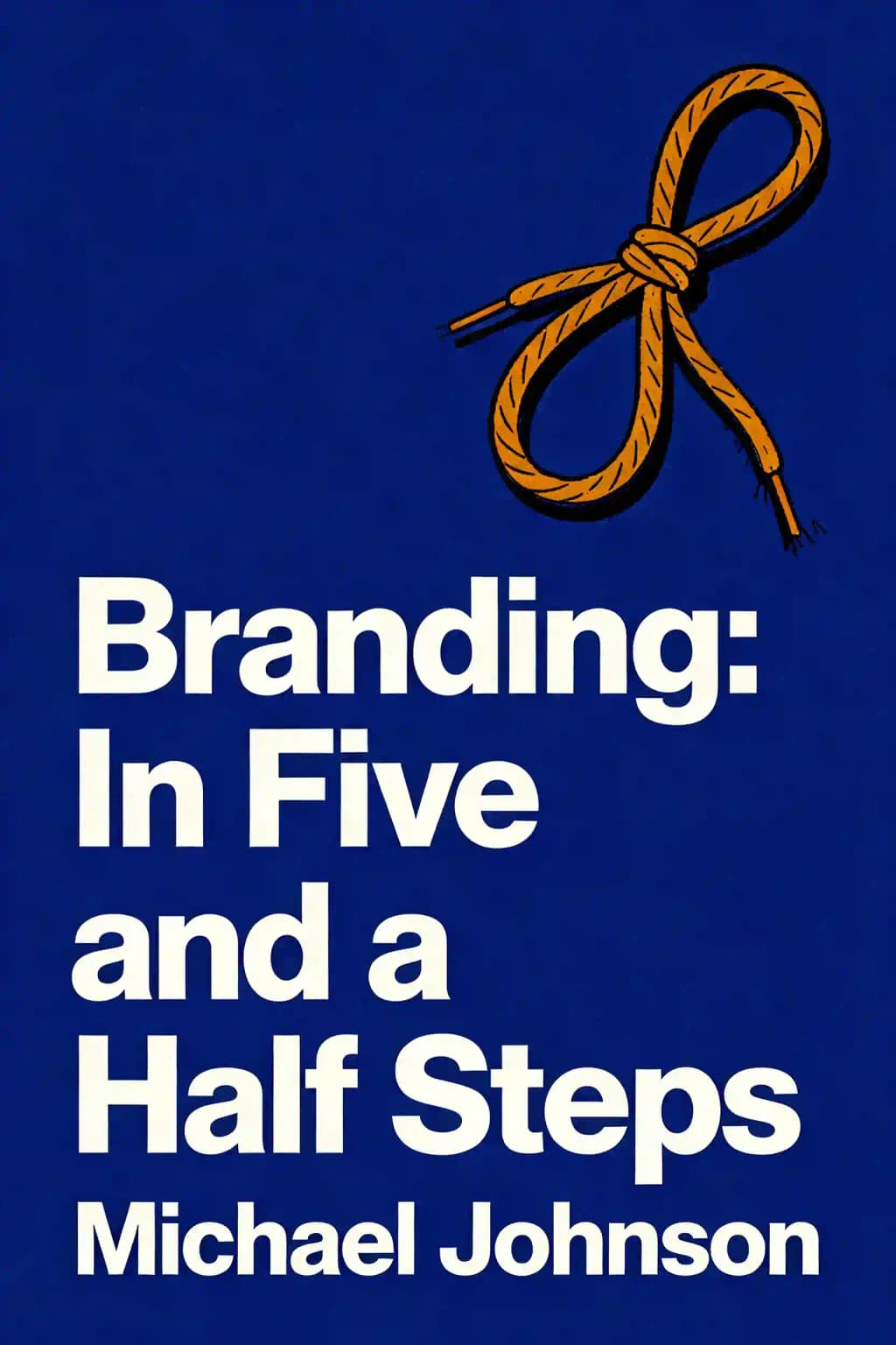
Ever wonder why you instantly recognize the swoosh on your Nike shoes or the apple on your laptop? It's not just about a clever logo. Branding has evolved from simple cattle markings into sophisticated systems that shape our daily decisions-from the coffee we drink to the phones we use. Michael Johnson's "Branding in Five and a Half Steps" pulls back the curtain on this mysterious art, revealing the comprehensive process that creates the world's most powerful brands. As one of the few books embraced by both strategic thinkers and creative designers, Johnson's work has become required reading in design schools worldwide and a go-to resource for entrepreneurs building their first brands. Unlike most branding books that focus exclusively on either strategy or design, Johnson bridges this gap by showing how successful brands seamlessly integrate both elements-making the invisible visible and turning complex ideas into emotional connections.
Глава 2
From Cattle Brands to Global Icons: The Evolution of Branding
Branding's journey from simple ownership marks to complex global communication systems is fascinating. It began with literal "branding" of livestock, evolved through early trademark registrations in the 1870s, and transformed during the mid-twentieth century with the birth of "corporate identity" and the graphic design profession. As organizations began asking deeper questions about what they stood for and how consumers perceived them, "corporate identity" seemed too visually focused, leading to the adoption of "branding"-a term broad enough to encompass both visual elements and emotional connections.
The evolution continued through distinct phases: the industrial era with the first trademark registrations (1870s), the modern era with early slogans and PR (1905-1936), the post-war consumer boom dominated by graphic design systems, the post-modern globalization era where advertising reigned, the early 1990s services economy where branding matured as a discipline, the anti-capitalism movement of the late 1990s, and finally today's digital era of omnichannel approaches, collaboration, and social responsibility.
Why do organizations brand or rebrand? The reasons are strategic: corporate changes (like Andersen Consulting becoming Accenture), structural realignments (Google creating Alphabet), competitive pressure, market gaps, perception shifts, product lifecycle ends, simplification needs, intellectual property protection, alignment with corporate strategy, and reflecting mergers or de-mergers.
The power of branding is immense when executed well. It can realign organizations, raise millions in donations or billions on stock markets, reposition companies and countries, and revitalize failing services. Even cultural icons like Santa Claus have undergone significant rebranding-transformed from European folklore figures into the red-suited character solidified by Haddon Sundblom's iconic 1930s Coca-Cola advertising.
Yet branding can't guarantee success. Enron collapsed despite having a logo designed by legendary Paul Rand-its "crooked E" becoming an inadvertently apt symbol of corporate corruption. As Rand himself warned, a well-designed logo reflects the business it symbolizes-sometimes revealing uncomfortable truths about the underlying enterprise.
Глава 3
The Investigation: Finding Your Brand's True North
Finding out where a brand stands in its market is a crucial first step. Without proper investigation and research, you'll create fantastic solutions for the wrong problems. Despite the temptation to rely on hunches or skip ahead to design, understanding market perception is essential for creating standout brand ideas.
Many sectors exhibit remarkable uniformity rather than demonstrating difference. Mass transportation logos are typically geometric and monogrammatic; university branding features crests and heraldic devices in blue, purple or red; tourism logos are multi-colored with hand-drawn lettering. This uniformity extends to corporate straplines, with countless organizations using similar language about "connecting," "reaching higher," and "helping others."
When faced with product uniformity, brand strategists must either find ways to create difference or seek clients with genuinely unique offerings. Sometimes discovering a core point of difference comes from simple measures, like Parker pens' campaign based on factory visit insights. Other times, honesty about market position becomes the differentiator, as with Avis's famous "We try harder" campaign that acknowledged their second-place status.
Before any useful branding discussions can begin, it's vital to understand the product's market position through various audits. Visual audits help brands see where they stand; verbal audits examine language use; behavioral audits analyze customer interactions; competition audits look at rivals' approaches; and peer audits benchmark against aspirational organizations.
Simple exercises like SWOT analysis (strengths, weaknesses, opportunities, threats) provide an effective platform for honest discussion. Interviewing key stakeholders early in the process provides valuable insights and prevents future conflicts. These interviews should determine whether the identified problem is actually the real issue and if the organization's perceived differentiators are genuine.
Market mapping provides a visual method to analyze competitive positioning and identify opportunities. A simple two-axis diagram (like economy/premium versus liked/disliked for car brands) reveals market gaps and competitive dynamics more effectively than lengthy presentations.
Sometimes breakthrough branding comes from challenging industry conventions. Dove transformed ordinary "creamy" products into a powerful movement by rejecting glossy beauty advertising norms with its "campaign for real beauty." By celebrating ordinary women with freckles and wrinkles, Dove dramatically increased sales while influencing how women are portrayed in media.
Revolutionary products often emerge from personal dissatisfaction rather than market research. Apple's iPod and iPad succeeded where others failed by simplifying existing technology with memorable design. Sony's Walkman originated from its founder's desire to listen to opera while traveling, Nike's waffle trainers from experimentation, and Dyson's innovations from an engineer's frustration with existing products.
Глава 4
Strategy and Narrative: The Heart of Your Brand
Forty years ago, this chapter wouldn't have existed. Brands were once considered purely visual elements, but today, verbal definition has become paramount. Great brands can now be "described" and planned before becoming visual. Short-form phrases often become as powerful as images, with memorable three-word straplines like "Just do it" becoming central to a brand's existence.
The language around brand strategy is often dense and impenetrable. People frequently ask about differences between brand essence, positioning, core truth, and core idea. Traditional mission and vision statements, typically written by management boards with limited brand understanding, tend to be quasi-military and aspirational but disconnected from day-to-day brand operations.
Start with the core-a central idea that defines your brand's purpose. Answer questions like "why are we here?" and "what have we been put on earth to do?" Clear purpose makes it easier for people to understand what you stand for. Examples include Save the Children's "No child born to die," Science Museum's "home of human ingenuity," and Innocent's purpose "to make natural, delicious and healthy drinks that help people live well and die old."
Rather than presenting a single "final route" for brand purpose, it's helpful to sketch multiple verbal scenarios. For example, an airline brand was presented with options like "Humanizing the business of travel," "Celebrate the magic of human flight," and "Get more out of life and life's adventures." These options facilitate discussion and workshops that navigate toward a final answer.
The process of examining an organization's core has revived interest in manifestos. From Marinetti's Futurist manifesto of 1908 to Apple's "Think Different" campaign of 1997, brands are rediscovering the power of strident prose to define what they stand for. When Steve Jobs returned to Apple, he crafted a manifesto that helped reposition the brand alongside newly designed products people wanted to buy.
Defining "what we do and how we do it" summarizes the functional aspects of a brand. While Samsung might describe themselves as designing "world-class technological solutions," they often don't form emotional bonds with customers. By contrast, Audi uses "Vorsprung durch Technik" (advancement through technology) to highlight their technological prowess, while Volvo has taken their workmanlike vehicle production and elevated safety as their key emotional driver.
Some brands deliberately avoid traditional marketing approaches, letting their products speak for themselves. Dyson, founded on innovative engineering, has no marketing department and claims not to "believe in brand at all," focusing instead on "invention and improvement." Similarly, Apple under Steve Jobs was reluctant to define its brand formally, letting its products communicate its values.
Brands can differentiate through radical honesty. Cancer Research UK boldly stated "research kills cancer"-a direct, combative stance that had been avoided by cancer charities who feared offending those affected or over-promising solutions. This straightforward approach provided a key point of difference in a competitive market.
Глава 5
Bridging the Gap: Where Strategy Meets Design
This transitional step acknowledges that branding isn't always a linear process. Projects take unexpected turns where verbal concepts and visual creativity overlap. Sometimes design discoveries prompt strategic reconsiderations, requiring flexibility between narrative and visual development.
While traditional branding follows a linear process where narrative is "locked down" before design begins, acknowledging the potential overlap between stages can lead to unexpected solutions. Rather than pretending this doesn't happen, it's better to manage expectations and delay final sign-off until after initial design exploration.
Organizations with limited budgets sometimes skip detailed research and narrative development, jumping straight to design. In these cases, coherent verbal narratives may emerge during or after the design process. For example, Parc de la Villette's communications redesign initially focused on creating visual coherence, with the phrase "jardin des cultures" emerging afterward as the verbal glue.
Design exploration can uncover powerful narratives. For an observatory north of Tokyo, the design process revealed visual analogies comparing cosmic phenomena to everyday objects-black holes to plug holes, Saturn's rings to hula hoops-which led to the core idea of "bringing the cosmos down to earth."
Brand architecture-how organizations structure their brand relationships-often requires creative solutions that blend strategy and design. While textbook models include monolithic (London Science Museum), endorsed (Olympic Games), and house of brands (Unilever) approaches, real-world applications typically become hybrid models.
Naming exemplifies the blurred boundary between strategy and design, requiring both creative thinking and administrative skill. With millions of names already registered globally, finding available options demands flexibility. Creative approaches include made-up names (Spotify), truncations (Flickr instead of Flicker), and mashups (YouTube, Facebook).
In today's environment, shorter names are prized, pushing brands to find abbreviated forms. Logical truncations like Federal Express to FedEx modernize brands, while complex names like "International Business Machines" naturally evolve to "IBM." However, acronyms can become problematic globally-organizations cling to them despite limited recognition.
Finding the right name has become critical in the internet age, where a name doubles as a web address and serves as the first touchpoint for audiences. Effective naming requires establishing clear criteria aligned with brand strategy, generating abundant options through collaborative workshops, maintaining objectivity, and navigating registration hurdles without being constrained by them.
Глава 6
Design: Bringing Your Brand to Life
The design phase represents what many consider the core of branding-creating or changing a brand identity that can generate enormous debate but, when executed well, can make people, companies, and products globally recognizable. This step builds on all previous work: market research, differentiation strategy, purpose definition, value articulation, and naming.
The design process begins with a briefing that can range from minimal to exhaustive. The ideal is somewhere in the middle-a short document with enough background to understand context, someone available to answer questions, and ideally, designers who have been involved in previous stages.
The design phase is where all the hard work from previous steps must find visual form. Many companies have moved from assigning a single creative to developing team approaches. This creates a Darwinian process where the best ideas rise to the top through editing, critiques and discussion. The most valuable ideas are often disruptive ones that question convention.
As brands become more complex, they can no longer be distilled into just a logo. Modern branding requires comprehensive "toolkits" that allow brands to be recognized through their attitude to imagery, photography style, tone of voice, and personality-not just the logo in the corner.
Typography often forms the foundation of modern brand identities because of practical realities-a company's "front door" is now their website domain name, a verbal destination. Effective logotypes plant visual hooks or mnemonic devices within words. Mobil's wordmark uses a single red "o" as a memorable element, while Shelter's "h" shaped like a house with a pitched roof visually connects the charity's name to providing "a roof over someone's head."
Despite the pressure of registering brand names, symbols remain powerful in modern branding. Starbucks has been refining its mermaid symbol for nearly five decades, though most customers no longer connect it to Seattle's maritime history-it's simply "green mermaid = coffee." Creating meaningful yet unique symbols is one of design's toughest challenges, requiring inspiration, perspiration and guts.
Online environments have created unique pressures on branding, requiring both full names (Google, Facebook) and recognizable "short-form" versions-the digital equivalent of cattle brands. These tiny manifestations, like Skype's "S" or Facebook's "F," must function effectively at extremely small sizes. The ultimate test is the 16x16 pixel favicon appearing beside web addresses, where brands are reduced to their most essential elements.
For multi-faceted organizations, distilling complexity into a single symbol often feels inadequate. The "Know Canada" campaign brilliantly demonstrates the framework approach-using the Canadian flag's red bars as constants while replacing the maple leaf with windows into the country's diverse culture. This "framing" technique has become popular over the last decade, allowing brands to showcase their multiplicity.
Some designers add dimension to brand identities by hiding shapes or designs within marks. FedEx's famous white arrow between the "E" and "x" goes unnoticed by many until pointed out, but once seen, adds another layer to the delivery brand's meaning.
Most branding work involves existing organizations with substantial brand equity, creating tension between desires for clean-slate redesigns versus evolutionary approaches. The skill lies in preserving what works while quietly dropping what doesn't. Amazon's redesign maintained its lowercase type and basic palette but strengthened the letterforms and transformed the orange swoosh into a smile-shaped arrow connecting "a" to "z"-subtly communicating both their comprehensive offerings and customer satisfaction.
Глава 7
Implementation: Making Your Brand Work in the Real World
Step 4 is arguably the most important phase where all the verbal planning and thinking must be transformed into something easily understood and used. Without proper implementation planning and clear direction, ideas can be introduced too quickly and get lost within a company.
First, finish what you started by finalizing core visual assets for all eventualities. This is where craft remains king-even seemingly simple ideas like the "lips" symbol for an artisan ice-cream manufacturer require countless iterations before reaching perfection. A full application list should be created with short, medium, and long-term priorities.
Many final tweaks are almost imperceptible but make enormous differences. The British Rail symbol appears to use parallel lines but actually employs optically widening lines to counteract the thinning effect. Typography frequently requires optical adjustments-crossbars in typefaces are often slightly thinner than downstrokes, and type arranged in circles needs special tweaking to appear harmonious.
Design manuals once notorious for their prescriptive rules and scolding language are evolving. A good manual should inspire users to create great things, not induce boredom or despair. The Barbican Centre's meticulously constructed manual serves as typographic inspiration, setting a high bar for external designers.
Modern brands need clear, flexible toolkits that differentiate them while maintaining coherence across multiple work streams. Coca-Cola uses its script, colors, swoosh device, bottle shape, and support typography. The Science Museum employs geometric, code-like typography in different weights, while the Premier League's identity features a re-engineered lion icon with vibrant colors and patterns.
Implementing brands globally requires adaptation into multiple languages. Some marks like Pirelli adapt well into languages like Arabic, while others use side-by-side bilingual approaches like Qatar Museums. Occasionally, languages can be combined, as with the UK-Japan joint projects logo that reads in both languages.
Uniqlo represents one of the greatest bilingual branding success stories. Born from the "Unique Clothing Warehouse" in Hiroshima in 1984, its name emerged from an administrative error when "uni-clo" was misread as "Uni-Qlo." After a decade of neutral branding, in 2006 Uniqlo adopted a distinctive bilingual approach with a customized font. Despite expanding globally with their "everyday clothes for a better life" philosophy, they've maintained their Japanese identity while conducting business primarily in English.
While core branding principles remain essential, the 21st century has demanded brands strengthen or launch in an ever-changing digital environment. Designs must now "flex" on screen, functioning equally well on web pages and as tiny icons in tweets. Some challenges are familiar but intensified-like creating "tiny use" logos at just 16 pixels across-while others are entirely new, like designing layouts that adapt to different browsers and devices.
Глава 8
Engage or Revive: Keeping Your Brand Alive
Step 5 represents several steps in one, depending on where a brand sits in its lifecycle. For new brands that have progressed through Steps 1-4, this is where the long-term work begins, especially with larger organizations. If a new direction isn't understood internally, implementation becomes an uphill struggle-this is where successful "engagement" becomes crucial.
Internal adoption becomes critical for long-term brand health, making the link between research and engagement vital. If staff were consulted during Step 1 through workshops or surveys, regular reporting back is both polite and politically savvy. Strategy, narrative and visual approaches should be shared as they're agreed, allowing staff to re-engage as early as possible.
This step involves testing and extending the words, ideas and designs from previous steps in real situations. Visual aspects can be explored through workshops where examples are discussed and solutions developed. For verbal elements affecting communication and behavior, this is the perfect time to establish what values mean in everyday usage. Staff workshops that explore how each value affects daily work not only help with brand definition but crucially involve staff in the process, enhancing buy-in.
When a brand's core purpose and tone of voice have been defined, translating these into written communications becomes critical. Testing with internal teams is essential-there's no point insisting on an "agit" tone if there isn't enough internal energy to sustain it. Effective brand messaging requires mapping the brand's purpose, personality and tone across different audiences using a messaging matrix.
A brand's verbal identity is as crucial as its visual representation. While some brands like Pixar and Virgin have an innate sense of how to communicate, many corporations benefit from guidelines on "how to speak." Finding the right tone can happen by accident-as with Shelter, whose brand book included the humorous but pointed reminder that words like "stakeholder" remind normal people of "either Dracula movies or politicians. Or both."
Eventually, brands reach a point where they must decide whether to evolve or completely reinvent themselves. For established brands like Sony, once defined by innovation but now criticized for "me-too" products, this decision becomes crucial. Brand tracking research can provide insights into audience perceptions, helping determine when change is needed.
Some brands require constant "tinkering" to stay relevant while preserving their core identity. Adidas, with its iconic three stripes that the company legally protected, has maintained relevance through creative collaborations with designers and celebrities while building on its sports heritage.
Some brands take decades to fully realize their potential. Kiehl's has maintained its apothecary-inspired identity for over 150 years, even after acquisition by L'Oreal, by staying true to its no-advertising approach, quasi-medical image, and culture of honesty reflected in its surgical-like packaging. Their strategy emphasizes sampling, word-of-mouth promotion, and authentic retail experiences.
Legacy brands can revitalize by reinterpreting their distinctive elements. Time magazine and National Geographic both leveraged their iconic borders (red and yellow respectively) as framing devices in campaigns that reinforced their brand essence. Great Western Railway embraced its 182-year heritage by rebadging as "GWR" to suggest a renaissance of rail.
Sometimes gradual brand evolution isn't viable. Royal & SunAlliance couldn't extend its "Dad's pension" brand image into the competitive direct insurance market, ranking 13th despite attempts. Their solution was creating an entirely new brand-More Th>n-with a distinctive name that embodied its "comparative" positioning of offering more than competitors. Within three years, the new brand secured a top-three position, demonstrating that sometimes complete reinvention is necessary.
Глава 9
The Branding Journey: From Strategy to Success
The evidence for branding's effectiveness is compelling when organizations gather pre- and post-rebrand data. Success stories include Paul Smith growing from one shop to 300 worldwide with 200 million turnover, Shelter increasing reach from 80,000 to 5 million users, DEC tripling fundraising for Gaza appeals, Innocent selling to Coca-Cola for 95 million, TED videos reaching a billion views, and Apple becoming the first $700 billion US company.
However, branding alone cannot fix fundamental business problems-that's why the early investigative steps are critical to identify what truly differentiates an organization before design begins. Branding's power has elevated it from departmental concern to boardroom strategy, transforming logos from mere visual identifiers into the tips of strategic icebergs that provide powerful competitive advantages.
The five-and-a-half steps to better branding provide a comprehensive roadmap: Investigation (knowing where you are before deciding where to go), Strategy and Narrative (answering key questions about purpose), Bridging the Gap (translating between verbal and visual work), Design (creating visual identity systems, not just logos), Implementation (ensuring consistent application), and Engage or Revive (launching, embedding, and continuously renewing brands).
In today's crowded marketplace, where products increasingly resemble one another and digital disruption is constant, branding has become more crucial than ever. It's no longer just about visual recognition-it's about creating meaningful connections, building trust, and communicating values that resonate with audiences. The most successful brands understand this evolution and embrace the full spectrum of branding from strategic thinking to creative execution, creating lasting impressions that transcend mere recognition to foster genuine loyalty and advocacy.