1장
The Psychology of Design: Where Human Minds Meet Digital Interfaces
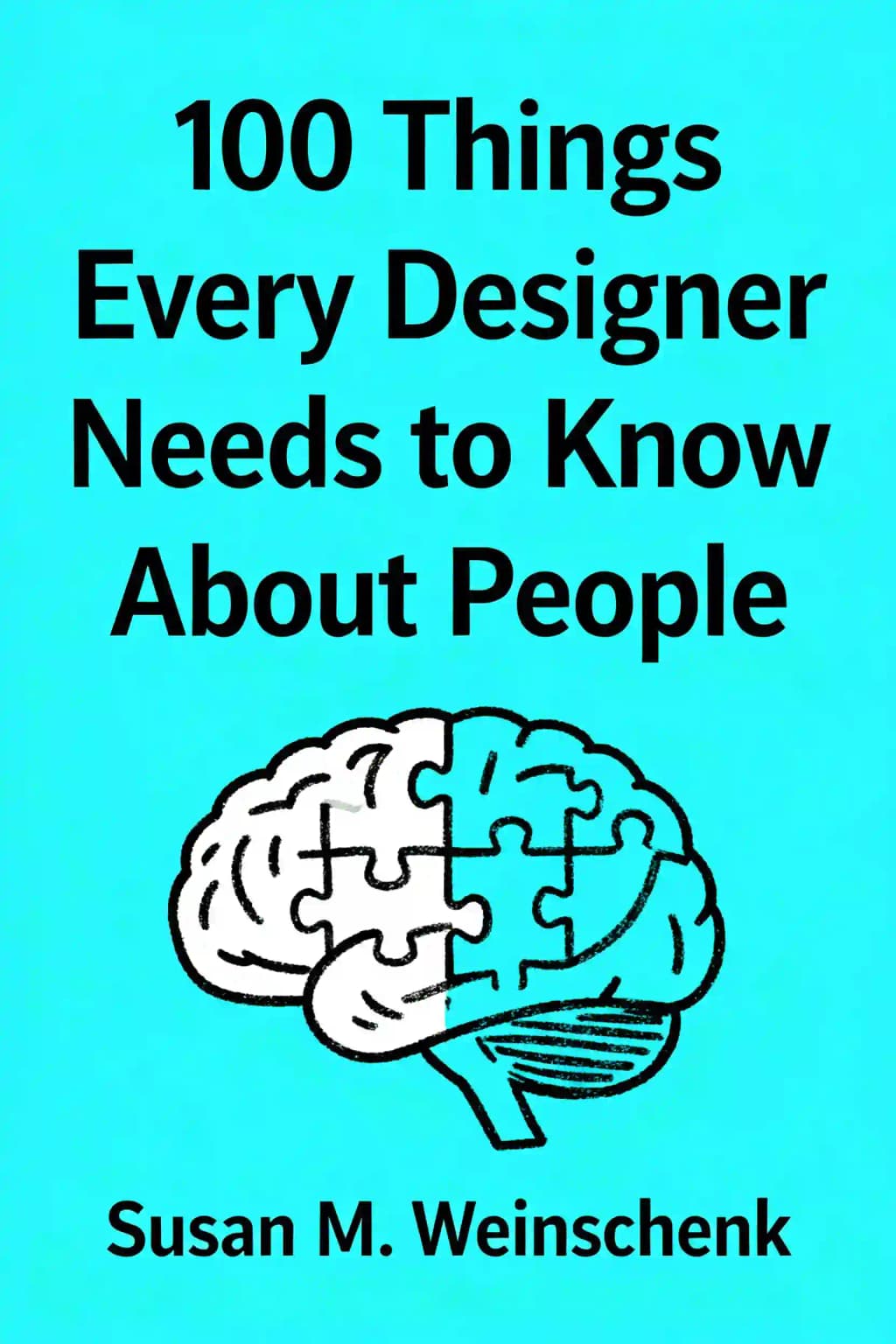
When Susan Weinschenk's groundbreaking work first appeared in 2011, it rapidly became required reading in design studios worldwide. Even tech giants like Apple and Google incorporated her insights into their design philosophies. What makes this book so compelling is its rare fusion of psychological research with practical design applications-a bridge between laboratory findings and real-world interfaces. Weinschenk, with her dual expertise in both psychology and user experience, reveals the hidden patterns of human behavior that explain why certain designs succeed while others fail miserably. In an age where digital experiences shape nearly every aspect of our lives, understanding these psychological principles has become essential not just for designers, but for anyone seeking to create more intuitive, engaging, and human-centered products. Let's explore the fascinating intersection of psychology and design that has influenced everything from the apps on your phone to the websites you visit daily.
2장
What You See Isn't What Your Brain Gets: The Illusion of Perception
Your brain is constantly playing tricks on you. What appears to be directly in front of you isn't necessarily what's physically present-it's an interpretation created by your visual cortex based on millions of sensory inputs. Consider the famous Kanizsa triangle illusion: you "see" a white triangle where only partial circles and lines exist. Your brain fills in the gaps, creating a complete image that isn't actually there. Similar effects occur with the Rubin vase illusion, where viewers alternate between seeing two faces or a vase, demonstrating how our brains actively construct meaning from ambiguous visual information.
This happens because your brain makes educated guesses based on past experiences to create a coherent picture of the world. While this shortcut works remarkably well most of the time, it can lead to errors and misinterpretations. The Muller-Lyer illusion demonstrates this perfectly-two lines of identical length appear different because of the directional arrows at their ends. Your brain's interpretation overrides the physical reality. The checker shadow illusion provides another striking example, where two squares of identical color appear drastically different due to the context of surrounding shadows and lighting.
Even more fascinating is that while we see in two dimensions (images projected onto our retina), our visual cortex transforms this flat input into three-dimensional representations. This transformation process involves complex neural mechanisms that process depth, movement, and spatial relationships simultaneously. What designers create isn't necessarily what users perceive, as each person's unique background, knowledge, and cultural experiences influence how they interpret visual information. For instance, people from different cultures may read directional cues differently based on their reading patterns (left-to-right versus right-to-left).
This has profound implications for design. When you create an interface, you're not just arranging elements on a screen-you're providing raw materials that users' brains will actively interpret and sometimes misinterpret. Strategic use of shading, color, and positioning can guide people to see relationships between elements that aren't explicitly connected. The Gestalt principles of proximity, similarity, and continuation demonstrate how our brains naturally group and organize visual information. For example, items placed close together are perceived as related, even without explicit connections between them.
The most effective designs acknowledge this gap between physical reality and perceived experience. They leverage the brain's pattern-recognition abilities while avoiding visual arrangements that might trigger misinterpretations. Design elements like whitespace, contrast, and alignment work because they align with our brain's natural tendency to seek order and meaning. Visual hierarchies succeed when they match our innate perceptual processes, such as our tendency to notice size differences and contrast variations. Remember: you're not designing what people will see, but what their brains will perceive, and this understanding should inform every design decision, from layout to color choices to typography.
Understanding these perceptual quirks can help designers create more intuitive interfaces. For instance, the use of shadows and gradients can create a sense of depth that makes interface elements appear more tactile and interactive, even though they're displayed on a flat screen. Similarly, the careful use of color and contrast can direct attention and create visual hierarchies that feel natural to users, even though they're carefully engineered psychological effects.
3장
The Brain's Pattern Recognition System: How We Make Sense of Visual Chaos
Our brains are pattern-making machines. When presented with visual information, we don't process each element individually-instead, we automatically organize what we see into meaningful patterns. Place eight dots in proximity to each other, and you'll likely perceive four pairs rather than eight individual dots. This grouping happens instantaneously and unconsciously.
According to Irving Biederman's Recognition-by-Components Theory (also called Geon Theory), we don't compare objects against millions stored in memory. Instead, we recognize about 24 basic geometric shapes-called geons-that form the building blocks of all objects. These simple shapes (cylinders, cones, wedges) allow for remarkably quick object recognition. When you see a coffee mug, your brain rapidly identifies the cylinder and handle components rather than matching it against every mug you've ever seen.
This pattern recognition system extends beyond simple object identification. The fusiform face area (FFA), a specialized brain region near the amygdala, allows us to instantly recognize faces in crowded visual fields. This specialized processing explains why faces grab our attention so effectively in designs. Eye-tracking research shows we tend to follow the gaze direction of faces in images-a person looking at a product will naturally direct viewers' attention there.
Even newborns less than an hour old prefer looking at facial features, suggesting we're born with this preference. Research using morphed human-to-mannequin faces shows we primarily use the eyes to determine if something is human and alive. Forward-facing faces create the strongest emotional connection, while faces looking elsewhere direct attention but don't necessarily ensure engagement.
For designers, these insights offer powerful tools. Leveraging patterns through thoughtful grouping and white space helps users quickly understand information hierarchies. Using simple geometric drawings for icons makes the underlying geons easier to recognize-especially important for small visual elements where quick recognition matters. And strategic placement of faces can direct attention precisely where you want it, creating both emotional connection and visual guidance.
4장
How We Navigate Screens: Cultural Patterns and Expectations
How do people scan a screen? The answer isn't as straightforward as you might think. While screen scanning patterns generally follow cultural reading direction (left-to-right or right-to-left), most viewers don't start at the top corner as traditional reading models suggest. Instead, they look for meaningful information about 30% in from the edges and top of the screen, having learned to skip past logos, advertisements, and blank spaces. This behavior, often called the "F-pattern" or "Z-pattern," has been consistently documented through eye-tracking studies across different cultures and demographics.
After this initial focus, people follow their normal reading pattern unless something visually compelling-like a face, bright color, or movement-draws their attention elsewhere. We develop mental models of where elements should appear based on past experience, and will look directly at those expected locations. For example, users expect search bars in the top right, navigation menus at the top or left side, and shopping carts in the upper right corner of e-commerce sites. When encountering errors or problems, users narrow their focus to just the problem area, often missing important information elsewhere on the screen - a phenomenon known as "tunnel vision" that can affect up to 60% of users during error states.
These scanning patterns are complemented by our recognition of affordances-visual cues that suggest how we should interact with objects. Well-designed elements have clear perceived affordances, like buttons with shadows suggesting they can be pressed, sliders that appear grabbable, or text fields with subtle borders indicating where to type. When affordances contradict actual function (like a pull handle on a push door, or a button that looks clickable but isn't), users become frustrated and confused, often leading to task abandonment rates of up to 70% in usability studies.
Modern interface design is unfortunately losing many important affordances in pursuit of minimalism-buttons becoming flat colored squares without dimensionality, hyperlinks losing their traditional blue underline cues, and hamburger menus hiding navigation options. This trend forces users to hover over elements to discover functionality, making interfaces less intuitive and increasing cognitive load. Studies show that removing traditional affordances can increase task completion time by 22% and error rates by 35%.
For optimal design, place important information 30% in from the top and left margin (or right for right-to-left languages), keep task-related information away from screen edges, and design page flow to match natural reading patterns. Consider the cultural context - Japanese users, for instance, tend to scan screens in a more circular pattern compared to Western users' F-pattern. Most importantly, incorporate clear affordance cues through shading, color, and familiar patterns to help users immediately understand how to interact with your interface. Use consistent visual hierarchies, maintain conventional placement of common elements, and ensure interactive elements are clearly distinguishable from static content. Remember that what seems obvious to you as a designer may be completely missed by users focused on their specific tasks, as shown by numerous usability studies where designers consistently overestimate the intuitiveness of their interfaces by 40%.
5장
The Limitations of Human Attention: Why We Miss What's Right in Front of Us
Have you seen the famous "gorilla video" experiment? When asked to count basketball passes between players wearing white shirts, 50% of viewers completely miss a person in a gorilla costume walking through the scene-even though eye-tracking evidence shows their gaze passed directly over it. This phenomenon, called inattention blindness, reveals how selective our attention truly is.
When focused on specific tasks, we filter out enormous amounts of visual information-even significant, unusual events happening right before our eyes. This filtering happens because our attention is a limited resource, and the brain prioritizes what it believes is relevant to our current goals.
This selective attention extends to screen changes as well. People frequently miss updates to their visual field when focused elsewhere, especially when they don't expect changes to appear. Even dramatic alterations to an interface can go completely unnoticed if they occur during screen refreshes or when users are concentrating on a specific task.
Color combinations can further strain our attentional systems. When different colored lines or text appear together, they can create an optical effect called chromostereopsis, where colors appear to sit at different depths-some jumping forward while others recede. This effect is strongest between red and blue combinations but also occurs with red and green. These color pairings create visual strain, making text difficult and tiring to read.
Additionally, about 9% of men and 0.5% of women have some form of color deficiency, most commonly affecting the ability to distinguish between reds, yellows, and greens. This isn't complete "color blindness" but rather difficulty differentiating between specific color ranges.
For designers, these attention limitations mean never assuming users will notice changes automatically. Add visual signals like blinking elements or auditory cues to ensure important changes get noticed. Avoid placing red and blue or red and green elements adjacent to each other, especially for text. And implement redundant coding schemes that don't rely solely on color to convey meaning-combine color with pattern, texture, or line thickness to ensure information remains accessible to everyone.
6장
The Memory Puzzle: Working Within Human Limitations
Our memory system is both remarkable and frustratingly limited. Working memory-our quick-access memory system that holds information for less than a minute-can maintain only three to four items simultaneously, not the "seven plus or minus two" that popular psychology often claims. This constraint applies not just to working memory but also to retrieving information from long-term storage.
This four-item limit explains why phone numbers are chunked (712-569-4532) and why we struggle when forced to remember more than a few pieces of information at once. Even chimpanzees demonstrate similar constraints, achieving 95% accuracy with four numbers but only 65% with five.
Memory is also resource-intensive and easily disrupted. We typically remember what happened at the end of an event (recency effect), but interruptions can cause us to forget endings entirely. During sleep, our brains consolidate new memories, deciding what to keep and discard. And perhaps most unsettlingly, memories aren't stored like computer files-they're reconstructed each time we recall them, changing subtly with each retrieval.
Elizabeth Loftus's research demonstrates how easily memories can be manipulated. Simply changing a word in a question (like "hit" versus "smashed" when describing an accident) significantly altered people's speed estimates and even created false memories of broken glass where none existed. This malleability makes self-reported past behaviors inherently unreliable.
Forgetting, however, isn't a design flaw in human cognition-it's a necessary feature. If we remembered every sensory input and experience throughout our lives, we'd be overwhelmed and unable to function. Hermann Ebbinghaus's forgetting curve demonstrates how quickly memories degrade unless stored in long-term memory through repetition or connection to existing knowledge.
For designers, these memory constraints have clear implications: provide information when needed rather than expecting users to remember it; break content into manageable chunks; use progressive disclosure to prevent overwhelming users with too much information at once; and leverage recognition over recall whenever possible through dropdown menus, autocomplete fields, and visual cues. The most user-friendly designs work with our memory limitations rather than fighting against them.
7장
The Social Brain: How Connection Shapes Our Experience
Humans are fundamentally social creatures, with specific brain regions dedicated to processing social information. When we listen to someone speaking, our brains literally synchronize with the speaker's brain patterns-a phenomenon called neural coupling. This remarkable synchronization occurs with a slight delay corresponding to communication time and only happens when listeners understand the language being spoken.
This neural alignment helps explain why audio and video presentations create deeper understanding than text alone-they trigger natural brain-to-brain connections that evolved to optimize human communication. It also explains why laughter is so powerful in bonding people together. Robert Provine's research reveals that people laugh 30 times more when with others than alone, and only 20% of laughter follows jokes-most occurs after ordinary statements, typically at sentence ends.
Our brains process information about friends and relatives differently than information about strangers, regardless of similarity in interests or opinions. When we think about friends-whether we share their views or not-the medial prefrontal cortex (MPFC) activates. This brain region, responsible for value perception and social behavior regulation, remains inactive when processing thoughts about strangers with whom we share interests.
This neurological distinction suggests that social media platforms connecting us with existing relationships (friends and family) generate more engagement and loyalty than those focused on connecting strangers with common interests. Our brains are fundamentally wired to prioritize established personal connections over similarity-based relationships.
The strength of social bonds is also influenced by shared activities. Synchronous behaviors-actions performed together in physical proximity where everyone does the same thing simultaneously-create powerful social cohesion. Research demonstrates that people who engage in synchronous behaviors like walking in step or singing together become more cooperative and willing to make personal sacrifices for the group.
For designers, understanding these social mechanisms is crucial. Online interactions are subject to the same social expectations as face-to-face encounters. When websites or apps violate these expectations-by being unresponsive, asking for personal information too early, or failing to remember previous interactions-users experience the same discomfort they would in awkward human conversations. The most effective digital experiences acknowledge and work with these deeply ingrained social patterns.
8장
The Emotional Foundation of Decision-Making: Why Feelings Drive Choices
Despite our self-image as rational beings, emotions fundamentally drive our decision-making processes. Antoine Bechara's research reveals that people with damage to emotion-processing brain regions struggle to make even simple decisions, highlighting the essential role of feelings in choice-making.
This connection between emotion and decision-making is physically embodied. Botox recipients, whose facial muscles are paralyzed, experience diminished emotional reactions when viewing emotional content compared to those receiving non-paralyzing treatments. Joshua Davis and David Havas demonstrated that contracting specific facial muscles influences corresponding emotions-smiling muscles inhibit anger, while frowning muscles inhibit happiness.
Our brains are particularly responsive to certain emotional triggers. Unexpected experiences activate the nucleus accumbens (the brain's pleasure center) more strongly than predictable ones, regardless of whether we prefer the actual content. This explains why strategic surprise in design isn't just attention-grabbing-it's neurologically rewarding.
Music creates another powerful emotional pathway. Valorie Salimpoor's research using brain scans revealed that listening to personally meaningful music releases dopamine-the same neurotransmitter involved in pleasure from food or sex. Different brain regions activate during anticipation versus actual listening pleasure, creating a neurochemical reward system that increases both initial engagement and the likelihood of return visits.
Natural environments provide yet another emotional benefit. Denis Dutton argues our attraction to pastoral scenes featuring hills, water, and trees represents evolutionary preferences for habitats with protection and resources. Mark Berman's research shows exposure to natural settings provides "attention restoration"-participants who walked through an arboretum performed better on cognitive tasks than those who walked through urban areas.
For designers, these emotional mechanisms offer powerful tools. Combining factual evidence with illustrative stories engages different brain regions, creating deeper neural connections and stronger recall. Incorporating customizable music options leverages the dopamine reward system. And including natural imagery can reduce cognitive strain while improving subjective well-being. The most effective designs don't just present information-they create emotional experiences that resonate with our neurological wiring.
9장
The Paradoxes of Choice: How Decision Environments Shape Behavior
We face a fundamental contradiction in how we approach choices. While we're instinctively drawn to abundance-Iyengar's "jam study" showed 60% of shoppers stopped at displays with 24 varieties versus 40% for displays with just 6-we're paradoxically less likely to make decisions when faced with too many options. Only 3% of shoppers purchased from the larger jam display, compared to 31% from the smaller one.
This ten-fold difference in conversion rate demonstrates that while people believe they want maximum choice, too many options overwhelm our cognitive capacity to compare and decide. Our working memory can effectively process only three or four options simultaneously, making extensive choice sets paralyzing rather than liberating.
Yet we persistently equate choice with control. Research with animals and humans consistently shows we prefer having options over direct paths to identical rewards. Even four-month-old infants showed distress when their ability to control music through string-pulling was removed, despite hearing the same music at identical intervals. We equate having choices with having power over our environment, which evolutionarily increases our chances of survival.
Our decision-making processes are further complicated by two distinct, mutually exclusive neural systems. Habit-based decisions occur in the basal ganglia-like grabbing your usual cereal without consideration-while value-based decisions happen in the orbitofrontal cortex (OFC), where logical comparison and planning take place. These systems never operate simultaneously; when one activates, the other goes quiet.
This neurological toggle switch gives designers strategic control over user decisions. If you want someone to continue their current behavior, minimize information to keep them in habit mode. Conversely, if you're hoping they'll consider alternatives, provide detailed comparison information to activate value-based decision-making.
Social validation adds another layer to decision-making, especially during uncertainty. Yi-Fen Chen's research revealed that while expert opinions and website recommendations matter, reviews from "regular people like me" are most influential of all. This explains why Amazon's review system works so effectively-when uncertain about a purchase, we instinctively look to others' experiences to guide our decisions.
For designers, these insights suggest clear strategies: limit options to prevent decision paralysis; offer just enough choice to satisfy the psychological need for control; present information strategically based on whether you want to maintain habits or encourage reconsideration; and incorporate social proof to guide decisions during uncertainty.
10장
Designing for Human Reality: Embracing Our Limitations and Strengths
The most effective designs work with human psychology rather than against it. We are not the perfectly rational, attentive, and consistent beings that traditional design approaches often assume. Instead, we have specific cognitive strengths and limitations that shape how we interact with the world.
Our attention spans are severely limited-we can sustain concentration for only 7-10 minutes before it begins to wane. We selectively attend to only the most relevant attributes of objects, filtering out enormous amounts of information. Despite widespread confidence in our multitasking abilities, most of us are actually task-switching-attending to only one cognitive activity at a time, with significant performance costs when we attempt to divide our attention.
Certain stimuli automatically capture our attention regardless of our conscious intentions-food, sexual imagery, potential dangers, movement (especially video), and human faces looking directly at us. These triggers activate our evolutionary "old brain" that constantly scans for survival-relevant information. We can't help noticing these elements because our brains are answering three fundamental questions: "Can I eat it? Can I have sex with it? Will it kill me?"
Under stress, our cognitive abilities deteriorate significantly. The Yerkes-Dodson law demonstrates that while mild arousal improves performance, excessive stress severely impairs attention, memory, and problem-solving. Complex tasks are particularly vulnerable, requiring less arousal for optimal performance. This explains why seemingly simple interfaces can become impossible to navigate when users are under pressure.
Human errors follow predictable patterns that can be classified and anticipated. Rather than attempting to eliminate all errors (impossible), effective design focuses on minimizing those with negative consequences while allowing for the educational benefit of positive-consequence mistakes. The best error messages explain what happened, why it's a problem, how to fix it, all in plain, active language-though the ideal error message is no message at all through thoughtful design that prevents errors from happening.
The most human-centered designs acknowledge these realities. They provide just enough information at just the right time. They leverage our pattern recognition abilities while avoiding overwhelming our limited working memory. They accommodate our social nature and emotional decision-making processes. And perhaps most importantly, they forgive our inevitable mistakes, creating experiences that feel intuitive not because they're simple, but because they align with how we actually think, feel, and behave.