Chapitre 1
The Digital Revolution's Broken Promise: Reimagining Books for the Touchscreen Era
When Amazon released the Kindle in 2007, followed by Apple's revolutionary touchscreen iPhone, Peter Meyers felt the same excitement many book lovers did. Finally, the future of reading had arrived! Yet that initial thrill quickly gave way to disappointment. The digital books that followed were riddled with conversion artifacts, clunky navigation, and limited functionality compared to their print counterparts. Meanwhile, iPad's vaunted "multimedia" and "interactivity" often meant awkwardly wedged videos and excessive linking that seemed more focused on showing off device capabilities than enhancing the reading experience.
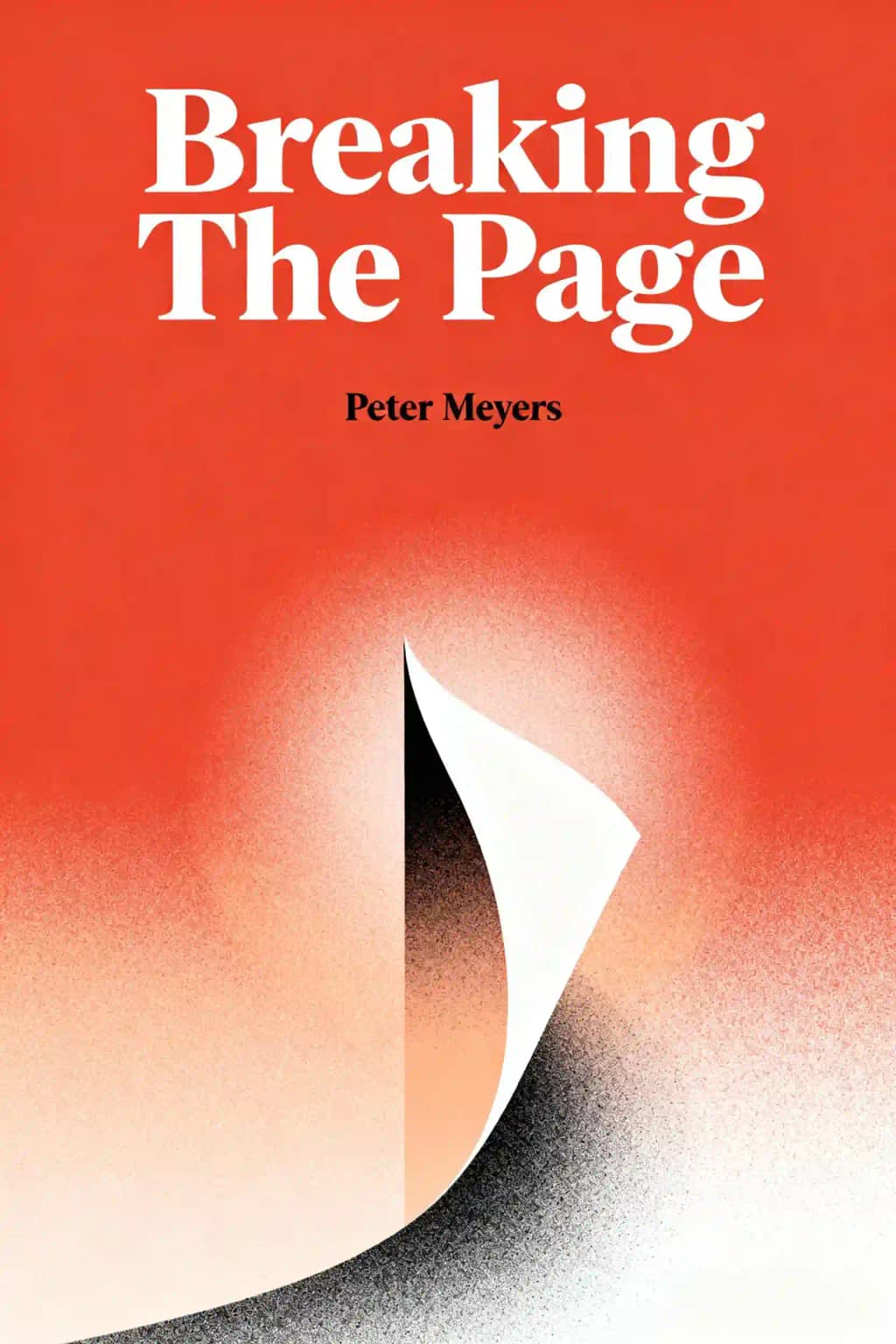
This frustration led Meyers to create "Breaking the Page," a manifesto for reimagining digital books from the ground up. The book has become something of an underground classic among digital publishing professionals, with companies like Apple and Amazon reportedly using it in their design departments. Even celebrities like Stephen Fry have praised its vision, calling it "essential reading for anyone who cares about the future of books." What makes Meyers' approach unique is his focus on reader experience rather than technological wizardry-a refreshing perspective in an industry often dominated by engineers rather than editors. His work addresses the fundamental questions facing touchscreen document creators: How can digital books remedy print's shortcomings? What is the purpose of the page in digital contexts? And perhaps most importantly, how can we create truly reader-friendly productions across different reading scenarios?
Chapitre 2
Beyond the Table of Contents: Reimagining Book Navigation
Traditional tables of contents read like "proceedings from an adjective-haters' convention"-dry, lifeless lists that efficiently summarize a book's contents but offer little enticement to explore. Why must they be so boring? What if TOCs were actually enjoyable to browse? What if they included spotlight guides to especially interesting sections or suggested reading paths based on different reader interests?
Writers naturally prefer certain parts of their work over others. Rather than hiding this fact, digital publications can embrace it by offering both traditional TOCs and curated highlight tours showcasing what makes the book particularly worthwhile. This approach acknowledges a fundamental truth: not all content deserves equal attention, and readers appreciate guidance about where to focus their limited time.
The physical act of flipping through pages provides irreplaceable browsing pleasure that most digital devices fail to replicate. Clicking between pages feels tedious, and even touchscreen controls like iBooks' page scrubber offer little glimpse of actual content. Some innovative publications have developed solutions, like Al Gore's "Our Choice" app with lightning-fast swiping between chapters, or Hearst's "Popular Mechanics" app that lets readers control thumbnail size-small for quick navigation, large enough to actually read content.
An emerging convention has users swipe horizontally between articles and scroll vertically to read in depth-scanning the horizon versus drilling down. The key insight: there's no need to replicate print page proportions when browsing; what matters is providing meaningful information at a glance that helps readers decide where to invest their attention.
Chapitre 3
Start Screens: Home Pages for Books
What if books had a "start screen" instead of a table of contents? Traditional TOCs impose a specific reading order that works for narratives but feels arbitrary for collections like cookbooks, travel guides, or essay compilations. On single-screen devices where flipping between sections is difficult, important content can get buried in the back matter, never to be discovered.
A home page-style layout-what Meyers calls a "Matrix of Contents" or "Start Screen"-actively promotes different reading journeys. Poetry collections could offer both chronological listings and thematic groupings; cookbooks could organize recipes by time available, ingredients on hand, or dietary restrictions. Digital books can include both traditional TOCs and these alternative entry points, functioning like playlists for book content.
Mark Bittman's "How to Cook Everything" app demonstrates this approach with finger-friendly buttons for browsing recipes, searching, and accessing curated sections like "Most Popular" and "Quick Dinners." The iPad version expands with photos, tutorials, and kitchen tools like timers. Both include "Bittman's Picks" with themed collections like "102 Essential Recipes"-exactly the kind of expert curation readers value.
Logos Bible Software takes the start screen concept further with a newspaper-like home page balancing easy navigation with fresh content. Beyond simply accessing the Bible, users can compare translations, consult commentaries, and explore a vast library. The dynamic start screen prevents reading ruts by featuring daily-changing content: Book of the Day highlights, recommended readings, customizable reading plans, and more. This approach ensures users always discover something new while maintaining quick access to core content.
The "Golfplan with Paul Azinger" app replaces a traditional TOC with a personalized approach, opening with a brief quiz about your game weaknesses. After identifying problem areas like driving or short game, it generates a four-week training calendar of targeted lessons. While the complete video collection remains accessible through a traditional menu, the personalized learning path creates a more effective entry point than a standard content listing.
Chapitre 4
Visual Navigation: When Images Speak Louder Than Words
Visual-rich topics demand more than text-only TOCs. Photo-based browsing layouts leverage the brain's ability to process images faster than words - typically 60,000 times faster according to cognitive research. These visual menus serve not just as guides but as content marketers competing for attention against unlimited alternatives in today's media-saturated environment. Well-designed visual navigation helps "sell" reading choices to time-limited readers through minimal text and maximum visual appeal, creating an immediate emotional connection that text alone struggles to achieve.
Weber's on the Grill iPad app presents finished recipes in a vertically scrollable grid, strategically limiting visible options to 12-15 items at a time to prevent overwhelming users while maintaining access to the full collection of over 280 recipes. Each recipe thumbnail combines appetizing photography with minimal text overlay, creating an at-a-glance menu that speaks to both practical and aspirational cooking goals. The Appetites app takes a bolder approach with larger showcase photos that fill 80% of the screen, enhanced by professional food styling and 15-second audio pitches from celebrity chefs that create a multi-sensory browsing experience. These audio snippets feature personal anecdotes and cooking tips that help build connection and trust with users.
Gourmet Live's iPad app combines visuals and text in an irregular grid layout that creates visual hierarchy through varying box sizes-communicating importance through size differentiation. Feature stories occupy larger spaces with dominant images, while shorter pieces and recipes appear in smaller tiles, creating an intuitive information architecture that guides users' attention naturally through the content landscape.
Sometimes a simple picture serves as the perfect interface. Object maps-visual representations of the subject matter that function as navigation tools-offer three distinct advantages over text descriptions: they're faster to process (often in milliseconds), provide crucial spatial context missing from text lists, and eliminate the cognitive burden of translating words into mental images. The JFK Library's "The President's Desk" interface exemplifies this approach, using the iconic Oval Office Resolute desk as an entry point to multimedia archives containing over 1,000 historical items. Interactive elements are highlighted with subtle lightbursts and yellow outlines on mouseover, encouraging natural discovery and exploration in ways a traditional text listing couldn't match. This approach has increased average session duration by 40% compared to their traditional navigation system.
The success of visual navigation systems depends heavily on image quality, careful curation, and thoughtful information architecture that balances visual appeal with functional clarity. When executed well, these systems can dramatically reduce cognitive load while increasing user engagement and content discovery.
Chapitre 5
Timelines: Navigating Temporal Content
Timelines offer three key attractions as browsing structures: bird's-eye views of key events, non-linear exploration for collections, and narrative clarity for complex stories. The ideal timeline design arranges events horizontally (matching our "march of time" metaphor), works well with touchscreen swiping, and uses static backgrounds to maintain focus on the changing events.
The iPad app "History of Jazz: An Interactive Timeline" exemplifies timeline browsing done right. Its two-tiered structure features genre periods at the bottom and a rich media collection at the top. Users can swipe horizontally through photos, YouTube clips, and iTunes samples of over 100 artists. While it excels as a curated music catalog with its tapas-style browsing experience, it falls short as an actual history lesson, offering Wikipedia entries rather than sustained historical analysis.
"The Civil War Today" iPad app uses a timeline with a clever twist: it releases new archival material each day, matching the calendar from 150 years ago. On April 12, 2011, users accessed content from April 12, 1861, with new material unlocking daily for the war's four-year duration. This "you are there" approach keeps audiences engaged over time, though it potentially frustrates readers eager to move ahead.
Even short texts can benefit from timeline tools that help readers track narrative sequences. The Atavist, a publisher of long-form journalism, embeds timeline panes that appear when readers tap clock icons in the text. These timelines include thoughtful spoiler alerts and can be easily hidden when readers prefer plain prose-a perfect example of digital enhancement that serves the reading experience rather than distracting from it.
Chapitre 6
Zooming Out: The Big Picture Perspective
Just as authors often use wall-mounted scene cards to organize their writing, readers benefit from tools that let them shift between macro and micro views of a book. Zoomable interfaces allow readers to quickly answer questions about where an argument is heading, why certain details matter, or which sections might be more engaging.
The Glo Bible offers a telescoping feature that serious non-fiction readers would love: the ability to zoom from a high-altitude view of the entire book down to specific sections and ultimately to particular passages. On the iPad's touchscreen, this process becomes delightful-users simply tap to move between levels, making it easy to browse at an outline level before swooping in to read specific content. The zooming gestures feel natural-spread fingers to dive in, pinch to zoom out-reducing the need for instructions.
The New York Public Library's Biblion app attempts to digitally recreate the experience of browsing library stacks with its innovative 3D-ish theme browser. Organized around major focal points like "Fashion, Food, and Famous Faces," it creates a content browsing system reminiscent of the gesture interfaces in Minority Report. Users swipe across a 3D information landscape to browse different themes, each displaying headlines atop icons representing photos, essays and other content.
Robert Darnton, Harvard's library head, proposes an innovative ebook structure to solve the problem of academic writers with too much material and readers with too little time. His "pyramid" design features layered content: the top layer offers a concise overview, with subsequent layers containing expanded arguments, documentation, theoretical discussions, pedagogical materials, and reader commentary. This structure enables multiple reading styles-some might skim the narrative, others might read "vertically" to pursue themes deeper into supporting essays, while others might forge their own paths based on personal interests.
Chapitre 7
Search Reimagined: Beyond the Basic Lookup
Compared to a print book's index, most ebook search functions fall woefully short. When readers search for a term like "Phil" in Laura Hillenbrand's Unbroken, they're confronted with hundreds of irrelevant results. Though search should be a marquee advantage of ebooks, poor implementations have made it frustrating.
Understanding why readers search is crucial-they often want quick lookups about characters or concepts without losing their place in the text. Unlike web searchers, book readers typically don't want to navigate away from their current passage; they simply need a quick reference before continuing. Effective ebook search tools should provide accurate results with sufficient surrounding context, clearly highlight terms on destination pages, and make it easy to return to the original reading position.
Traditional book indexes often don't survive the transition to digital formats, yet they provide unique services beyond simple term lookup. Unlike search, indexes include concepts rather than just words, provide guided discovery, help when readers know what they want but aren't sure how to describe it, signal depth of coverage, provide a handy tally of mentions, and give browsers a sense of the book's coverage.
An ideal implementation would place index access in both the navigation menu and search interface, featuring a familiar three-column layout that preserves the serendipitous discovery that adjacent terms provide, with preview screens showing occurrences and related terms. This partnership could be facilitated by offering an option to head over to the index directly from the search box, providing readers with multiple pathways to find information.
Chapitre 8
Advanced Finding: Filters, Visual Search, and Voice
Sometimes readers know what they're looking for but struggle to find it without proper tools. Search filters help weed out unwanted results with accuracy and speed, quickly narrowing thousands of items to just a dozen. The challenge lies in creating database-searching systems that don't look like databases. Amazon's shopping tool exemplifies this with simple checkboxes that let users select criteria and instantly filter results.
The iBird app demonstrates how specialized search tools can help readers find specific matches among thousands of species. While traditional page-flipping is available, the main finding method lets users select from dozens of attributes across multiple categories like Habitat, Song, and Flight. Zagat's digital apps improve upon their print editions with sophisticated filtering systems that let users toggle specific criteria like neighborhood, cuisine, and price range.
Instead of just adding multimedia elements that bleep and blink, digital books can leverage audio and visual capabilities to enhance search functionality. With visual content and microphone-enabled devices, users can tap what they want to know more about or speak their queries directly. When text-based lookup isn't feasible because we don't know the name of what we're looking for, visual search becomes invaluable.
Healthline's BodyMaps exemplifies this approach, allowing users to explore nearly a thousand muscles, bones, and organs through zooming and layering. The zoom-to-search functionality offers "Powers of Ten"-style insights, revealing increasing detail rather than just larger pixels. Heart Pro takes this further by letting users toggle specific anatomical systems on or off and adjust their transparency.
Pattern recognition technology feels almost magical-snap a photo of something interesting and get instant information about it. While still in its infancy, apps like Leafsnap demonstrate the potential. Parents no longer need to deflect their five-year-old's tree identification questions-they can simply photograph a leaf on white paper and submit it to Leafsnap's database for identification.
Voice recognition has improved enough that speaking searches sometimes works better than typing. It's most effective for reference materials-dictionaries, cookbooks, first aid guides-where quick, specific lookups are needed. As touchscreen devices proliferate and voice recognition improves, speaking to our books will likely become as culturally accepted as people talking into earpiece microphones on the street.
Chapitre 9
Navigation Challenges: The Digital Reading Experience
Digital book navigation presents challenges that print readers never face-determining how many pages remain in a chapter, returning to your place after following hyperlinks, or flipping between endnotes and text. These seemingly simple tasks become surprisingly difficult in digital formats, requiring innovative solutions to replicate or improve upon the intuitive physical navigation of print books. The challenge is particularly acute when readers need to compare multiple passages or reference earlier sections, actions that in print books might involve holding multiple pages with fingers or using physical bookmarks.
Finding specific passages in ebooks lacks the physical memory cues that print provides. Print readers often remember content spatially-"it was on the upper-right side, about this far into the book"-using the physical page stack as a memory framework. Digital formats eliminate these tactile reference points, and features like adjustable font sizes mean content positioning is inconsistent. This inconsistency affects not just casual reading but also academic study and research, where precise location references are crucial. Students particularly struggle when trying to cite specific passages or collaborate with peers using different devices or settings.
Inkling's textbook platform demonstrates how a detailed table of contents can become an effective finding tool. Unlike traditional TOCs that only list headers, Inkling's system provides fine-grained navigation with a two-column approach: chapters in the left pane and detailed section listings in the right, including icons for figures, sidebars, and multi-level headers. This design enables quick skimming and content previewing. The platform also incorporates interactive elements like expandable diagrams and embedded quizzes, making navigation not just about finding content but engaging with it meaningfully.
While TOC-based navigation works for structured textbooks, novels and narratives present different challenges. Print books provide physical memory cues that help readers recall passage locations emotionally and spatially, but ebooks lack these fixed reference points. Progress indicators like "Location 2168" require cognitive translation that physical books don't need. Some e-readers attempt to address this by showing time-to-completion estimates or percentage progress, but these solutions still fall short of the intuitive feedback that physical books provide. The challenge is compounded in fiction, where readers often want to flip back to review character introductions or earlier plot points, actions that require more deliberate navigation in digital formats.
Modern e-readers are experimenting with new navigation paradigms, such as heat maps showing popular highlights, visual timelines of story events, and character relationship maps. These innovations aim to compensate for lost physical cues by providing new types of contextual information. However, the fundamental challenge remains: creating a digital navigation experience that feels as natural and effortless as handling a physical book while adding valuable features that print cannot provide.
Chapitre 10
The "Are We There Yet?" Problem
The age-old question "How long till we get there?" plagues both traveling children and readers alike. For readers, the anxiety stems from wanting to know how long until the next stopping point-whether we're reading in bed, approaching our subway stop, or facing an imminent conference call. This fundamental need for orientation within a text is deeply ingrained in how we process and navigate information.
Print books make this easy through multiple physical cues: insert thumb, page ahead, calculate remaining time. The tactile feedback of paper thickness on either side of your current position provides instant, intuitive feedback about progress. Readers can quickly flip ahead to chapter breaks, section endings, or simply gauge how many pages remain in the current chapter - all while maintaining their place in the text with a finger.
Digital books, however, levy what Meyers calls a "400 percent digital tax" on this simple action. Moving ahead six pages takes about six seconds, plus another six to return-compared to three seconds total in print. This increased temporal cost fundamentally changes how readers interact with the text. The inability to quickly scan ahead or flip back creates a more linear, confined reading experience that can feel claustrophobic to experienced readers.
Current solutions fall short of addressing this navigation challenge. iBooks offers a dotted progress line that mimics physical books but provides minimal navigational value, with confusing page counts and unhelpful "pages left" indicators. These artificial constraints often lead to reader frustration, especially when trying to gauge time commitment for upcoming sections. Inkling's "spine" offers a better approach-a persistent location marker showing proportionally-sized segments that represent section lengths, with a white dot tracking current position. This solution begins to leverage digital capabilities while maintaining intuitive navigation.
The fundamental problem is that most e-readers stubbornly replicate print conventions rather than embracing digital possibilities. Even Apple's supposedly helpful footer controls create what Meyers calls a "Looneytunes department of interface design" with signposts that confusingly appear and disappear. The result feels like "sucking candy with the wrapper still on." This skeuomorphic approach - attempting to replicate physical book features in digital form - often creates more problems than it solves. Digital books have the potential to offer enhanced navigation through features like instant chapter previews, smart progress indicators, and customizable waypoints, yet most platforms remain trapped in print-based paradigms.
The challenge of digital navigation reflects a broader tension in the evolution of reading technology: balancing familiar metaphors with new capabilities. Until e-reader designers embrace truly digital-native solutions, readers will continue to struggle with this fundamental aspect of the reading experience.
Chapitre 11
Bookmarks Reimagined: Keeping Your Place and More
Bookmarks are deceptively powerful tools that do more than simply mark reading progress. In physical books, they provide instant visual reminders of important locations, indicate how many reference points you've created, and offer immediate access to those spots.
Digital books sacrifice these benefits. When you pick up a Kindle Fire, you must first turn it on, launch the reading app, and navigate to a bookmark list that lacks all the "geospatial cues" of physical bookmarks. Worse, moving between your current reading position and bookmarked spots requires cumbersome navigation that disrupts the reading experience, making quick reference checks simply not worth the trouble.
Glo Bible software offers a promising solution with its "sessions" feature. Similar to computer windows, sessions let readers launch multiple views of the same book simultaneously. By swiping or clicking between views, readers can quickly flip back and forth between different spots in the text-a reader-friendly navigation approach perfect for Bible readers who often compare different books.
This concept could revolutionize academic reading, allowing students to keep a primary text open alongside critical commentary, or letting novel readers check back on earlier chapters without losing their place. It's exactly the kind of innovation digital books need-not flashy multimedia additions, but thoughtful features that solve real reading problems while respecting how people actually use books.
The future of digital reading depends not on technological wizardry but on thoughtful design that truly understands readers' needs. As Meyers argues throughout "Breaking the Page," the goal isn't to replicate print or to add digital bells and whistles, but to create genuinely better reading experiences that leverage digital capabilities while preserving what makes books valuable in the first place. By focusing on fundamental reading tasks like browsing, searching, and navigating, we can create digital books that don't just match their print counterparts but surpass them-breaking the page to rebuild it better.