Slide design and the 50-millisecond trap
Struggling with messy decks? Learn how to use AI and visual hierarchy to turn cluttered slides into clear stories that win over your audience instantly.

Mejor cita de Slide design and the 50-millisecond trap
Great slide design isn't about decorating a message—it’s about revealing it. You move from being a 'slide builder' to being a 'meaning maker' by using the hybrid model of AI efficiency and human strategic storytelling.
Esta lección de audio fue creada por un miembro de la comunidad BeFreed
Slide


Preguntas frecuentes
This rule is essential because human working memory is limited and can only juggle about seven ideas for a very short period. When presenters crowd a slide with multiple charts or dense text, they create "extraneous load," which forces the audience's brain to shut down to save energy. By sticking to one idea per slide, you ensure the audience can grasp the core insight in three seconds, preventing your voice from becoming background noise while they struggle to read your content.
The hybrid model involves using AI as an "architect and heavy laborer" while the human remains the "lead interior designer and storyteller." AI tools handle the time-consuming tasks of research, drafting outlines, suggesting layouts, and generating custom imagery, which can reduce production time by approximately forty percent. The human presenter then uses that saved time to add strategic nuance, narrative flow, and brand consistency—elements that machines cannot yet replicate effectively.
Research shows that humans retain stories twenty-two times better than isolated facts because our brains are wired for narrative sequences rather than data points. By using a three-act structure—Setup (the current world and its complications), Development (the journey through data and turning points), and Resolution (the new world and a clear call to action)—you create "neural coupling." This causes the audience's brain activity to mirror the presenter's, moving them from simple understanding to a feeling that the proposed solution is necessary.
Double-encoding is a design principle where you use more than one visual cue to convey meaning, such as combining color with shapes, icons, or labels. This is a critical accessibility standard because relying on color alone (like red for danger and green for safe) excludes individuals with color vision deficiency who may see those colors as identical. By adding a checkmark or an "X" alongside the color, you ensure the message is clear to everyone regardless of how they perceive color.
The squint test is a tactical audit where you look at your slide with blurred vision to see if the most important element stands out. If the slide blurs into a uniform gray blob, the visual hierarchy is broken. A successful slide should have a clear three-level system: a bold level-one headline that is readable in three seconds, level-two supporting context, and level-three fine print for citations. Using a 60-30-10 color framework—where only ten percent of the slide uses a vibrant accent color—helps guide the eye directly to the most important "so what" of the data.
Descubre más

make ppt
This learning plan is essential for professionals and students who want to move beyond basic slides to create high-impact visual stories. It combines technical design skills with psychological storytelling and delivery techniques to ensure your message resonates with any audience.

Break the Algorithmic Loop
In an era of persuasive design, our attention is often hijacked by sophisticated algorithms. This plan is essential for professionals and students who feel drained by digital distractions and want to regain cognitive control using proven behavioral science.

The Unshakable Speaker
High-stakes communication requires more than just good slides; it demands total physiological and mental control. This plan is essential for leaders and professionals who need to maintain composure and authority when facing challenging audiences or intense scrutiny.

Pitch with Power and Handle Tough Questions
High-stakes presentations often fail due to early disengagement or an inability to handle aggressive questioning. This plan is designed for leaders and professionals who need to command executive rooms and turn skeptical audiences into decisive supporters.

Reclaim Your Attention
In an era of persuasive design, our focus is often hijacked by addictive algorithms. This plan is essential for professionals and students who feel drained by screen time and want to regain cognitive control through practical, science-based interventions.

Master AI & design writing
As AI transforms how we create, communicate, and design products, professionals need to understand both the technology and how to apply it thoughtfully. This learning plan is ideal for content creators, UX designers, product managers, and marketers who want to harness AI's potential while maintaining the human touch that makes great work resonate.

How to build habits.
In an era of constant distraction, mastering behavior architecture is the ultimate competitive advantage. This plan is designed for professionals and individuals seeking to replace friction with flow by leveraging neuroscience and systematic design.
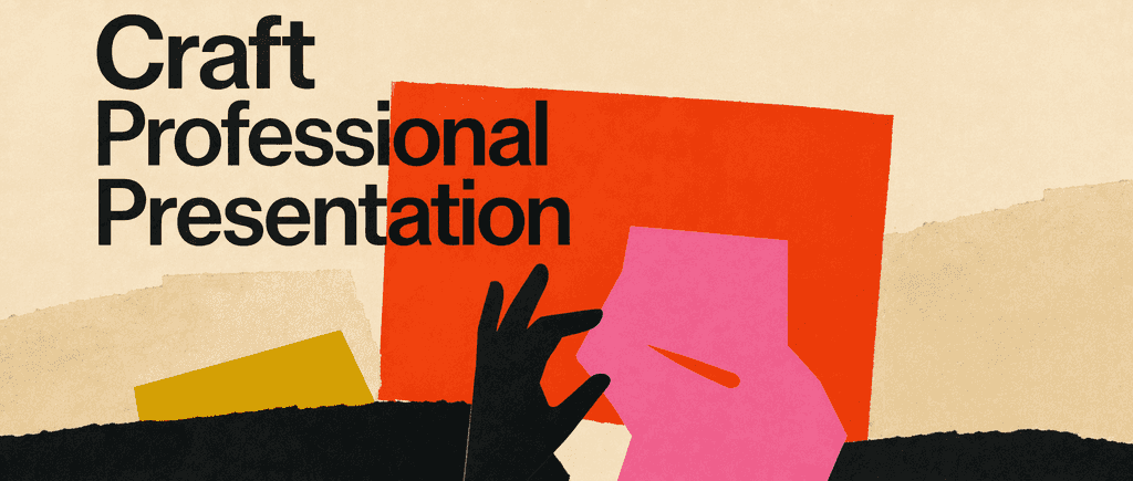
Craft Professional Presentation
Presentation skills are a critical professional asset that directly impacts career advancement and business outcomes. This learning plan helps professionals at all levels transform from nervous speakers to confident communicators who can persuade, inform, and inspire any audience.
Creado por exalumnos de la Universidad de Columbia en San Francisco
"Instead of endless scrolling, I just hit play on BeFreed. It saves me so much time."
"I never knew where to start with nonfiction—BeFreed’s book lists turned into podcasts gave me a clear path."
"Perfect balance between learning and entertainment. Finished ‘Thinking, Fast and Slow’ on my commute this week."
"Crazy how much I learned while walking the dog. BeFreed = small habits → big gains."
"Reading used to feel like a chore. Now it’s just part of my lifestyle."
"Feels effortless compared to reading. I’ve finished 6 books this month already."
"BeFreed turned my guilty doomscrolling into something that feels productive and inspiring."
"BeFreed turned my commute into learning time. 20-min podcasts are perfect for finishing books I never had time for."
"BeFreed replaced my podcast queue. Imagine Spotify for books — that’s it. 🙌"
"It is great for me to learn something from the book without reading it."
"The themed book list podcasts help me connect ideas across authors—like a guided audio journey."
"Makes me feel smarter every time before going to work"