Design Is More Than Making Things Look Pretty
Struggling to stand out in a crowded feed? Learn how to use visual hierarchy and consistency to guide user behavior and build a brand that works.

Design Is More Than Making Things Look Pretty最佳语录
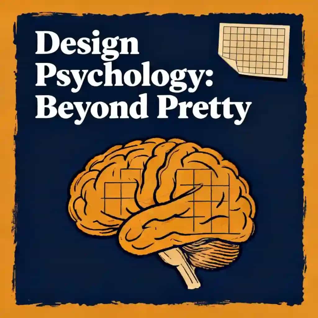
Every dollar invested in UX can return a hundred dollars because fixing a usability flaw during the design phase is a hundred times cheaper than trying to fix it after the product is already live.
此音频课程由 BeFreed 社区成员创建
design


常见问题
User-centric design shifts the focus from aesthetic "gut feelings" to solving actual functional problems based on research and evidence. According to the script, every dollar invested in User Experience (UX) can return up to a hundred dollars, representing a 10,000% ROI. This is because identifying and fixing usability flaws during the initial design phase is significantly cheaper than trying to reprogram or rebrand a product after it has already launched.
Consistency builds trust and reduces "cognitive load," which is the mental effort required to learn a tool. There are three main layers: visual consistency (uniform colors, fonts, and icons), functional consistency (ensuring similar actions, like swiping, always produce the same results), and contextual consistency (meeting the "mental models" or expectations users have from using other similar products). When an interface is consistent, it becomes "invisible," allowing the user to focus entirely on their goal rather than the interface itself.
Hierarchy acts as a director for the user’s eyes, using size, color, contrast, and spacing to rank information by importance. By employing techniques like "progressive disclosure"—showing only essential info first and hiding complex details—designers prevent users from feeling overwhelmed. Effective hierarchy follows natural scanning behaviors, such as the F-shaped or Z-shaped patterns, ensuring that the most important call to action is the most visually prominent element on the screen.
The "emergency exit" principle, popularized by Jakob Nielsen, suggests that users must always have a clear way to undo an action or exit a process without feeling trapped. Examples include Gmail’s "Undo Send" feature or a simple "cancel" button on a form. Providing these safety nets reduces user anxiety and encourages exploration, as users know they can easily recover from a mistake or a wrong click without facing permanent consequences.
While accessibility is designed to remove barriers for the over one billion people worldwide with disabilities, it often improves the experience for everyone through "situational" benefits. For example, video captions help people in noisy environments, and high-contrast text helps someone reading a screen in bright sunlight. Designing for accessibility—such as ensuring large touch targets for mobile buttons—makes a product more usable for all people regardless of their current environment or physical constraints.
发现更多

design!
This comprehensive design learning path is essential for anyone looking to build or elevate their design career in today's innovation-driven landscape. It's ideal for aspiring designers seeking structured skill development, product managers wanting to think more like designers, entrepreneurs needing to create user-centered solutions, and experienced designers aiming to reach strategic leadership levels. The curriculum bridges foundational knowledge with cutting-edge practice, ensuring you're prepared for both current design challenges and future AI-integrated workflows.

Improve user experience and accessibility
In today's digital landscape, creating products that are both functional and inclusive is a critical competitive advantage. This path is ideal for designers and product managers looking to bridge the gap between basic usability and strategic, accessible user-centered design.

design leader mindset
Design leaders today must navigate beyond craft excellence to drive strategic business impact and cultural transformation. This learning plan is essential for experienced designers moving into leadership roles, current design managers seeking to elevate their strategic influence, and organizational leaders who want to build design-led cultures that foster innovation and deliver exceptional user experiences.

Elevate craft in design, branding & stories
This learning plan is essential for anyone looking to elevate their creative impact in today's experience-driven marketplace. It's ideal for designers, marketers, product managers, entrepreneurs, and creative professionals who want to move beyond tactical execution to strategic thinking that connects brands with people. By integrating design fundamentals, brand strategy, storytelling, and innovation methodology, you'll gain the comprehensive toolkit needed to create work that truly resonates and drives results.

Build a Sustainable Personal Brand
In an era of digital noise, true authority comes from strategic alignment and authentic depth rather than algorithmic chasing. This plan is essential for professionals and creators who want to build a lasting reputation that feels sustainable and uniquely their own.

Be Consistent & Market Myself Better
In an era of digital noise, the ability to maintain a consistent presence while clearly articulating your value is the ultimate competitive advantage. This plan is designed for professionals and creators who want to transition from sporadic efforts to building a powerful, recognizable personal brand.

Break the Algorithmic Loop
In an era of persuasive design, our attention is often hijacked by sophisticated algorithms. This plan is essential for professionals and students who feel drained by digital distractions and want to regain cognitive control using proven behavioral science.

Become a master of design
This comprehensive path is essential for aspiring designers and creative leads who want to move beyond basic execution into strategic leadership. It is ideal for professionals seeking to master the intersection of visual aesthetics, user experience, and systematic innovation.
"Instead of endless scrolling, I just hit play on BeFreed. It saves me so much time."
"I never knew where to start with nonfiction—BeFreed’s book lists turned into podcasts gave me a clear path."
"Perfect balance between learning and entertainment. Finished ‘Thinking, Fast and Slow’ on my commute this week."
"Crazy how much I learned while walking the dog. BeFreed = small habits → big gains."
"Reading used to feel like a chore. Now it’s just part of my lifestyle."
"Feels effortless compared to reading. I’ve finished 6 books this month already."
"BeFreed turned my guilty doomscrolling into something that feels productive and inspiring."
"BeFreed turned my commute into learning time. 20-min podcasts are perfect for finishing books I never had time for."
"BeFreed replaced my podcast queue. Imagine Spotify for books — that’s it. 🙌"
"It is great for me to learn something from the book without reading it."
"The themed book list podcasts help me connect ideas across authors—like a guided audio journey."
"Makes me feel smarter every time before going to work"