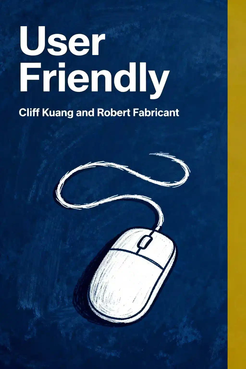
《Don't Make Me Think》概述
The web usability bible that's sold 700,000+ copies in 15 languages. Steve Krug's revolutionary approach - "Don't make users think" - transformed digital design forever. Why do industry leaders call this the one UX book everyone should read? Your websites will never be the same.
- Prioritize mindless clicks over thoughtful decisions for effortless navigation.
- Self-evident design trumps consistency when improving interface clarity.
- Eliminate half your page’s text twice to boost scannability.
- Mobile usability demands ruthless prioritization of core tasks and features.
- Test monthly with three users to uncover top frustrations.
- Users scan pages—structure content with bullet points and bold headers.
- Happy talk costs credibility—cut filler text to keep sharks moving.
- Persistent navigation requires a visible home button for reset reassurance.
- Steve Krug’s back button principle: users prefer familiar undo over memorizing paths.
- Fix by subtracting—remove distractions before adding explanations or features.
- Labeled search bars satisfy search-dominant users’ instinctive hunt behavior.
- Treat usability as ongoing hygiene, not a final pre-launch checkbox.
《Don't Make Me Think》作者介绍
Steve Krug, bestselling author of Don’t Make Me Think: A Common Sense Approach to Web Usability, is a pioneering user experience (UX) consultant and advocate for intuitive digital design. His seminal work, a cornerstone in web usability literature, distills complex UX principles into accessible, actionable guidance for creating user-friendly interfaces.
With over 25 years of experience, Krug has advised major clients like Apple, NPR, and the International Monetary Fund through his firm Advanced Common Sense, blending practical insights with humor.
The third edition of Don’t Make Me Think (2014) expands on mobile usability and reaffirms its status as a go-to resource for designers and developers. Krug’s follow-up, Rocket Surgery Made Easy, offers a hands-on guide to DIY usability testing, cementing his reputation as a leader in pragmatic UX education. His books, praised for their clarity and wit, have collectively sold over 700,000 copies worldwide and are widely used in tech curricula and professional training programs.
关于《Don't Make Me Think》的常见问题
What is Don't Make Me Think, Revisited by Steve Krug about?
Don't Make Me Think, Revisited is a user-centric guide to web and mobile usability, emphasizing intuitive design that minimizes cognitive effort. Steve Krug’s core principle—“Don’t make me think!”—advocates for self-evident interfaces, clear navigation, and eliminating unnecessary complexity. The book blends practical advice with humor, covering usability testing, information hierarchy, and common design pitfalls, making it accessible for both beginners and experienced professionals.
Who should read Don't Make Me Think, Revisited?
This book is essential for UX designers, web developers, product managers, and marketers involved in digital product creation. It’s equally valuable for entrepreneurs or content creators seeking to improve user experience. Krug’s straightforward style makes it ideal for anyone new to UX principles or teams aiming to align on usability best practices.
Is Don't Make Me Think, Revisited worth reading?
Yes. With over 700,000 copies sold globally and translations in 15 languages, it’s a foundational UX resource. Readers praise its actionable insights, concise format (readable in a few hours), and real-world examples. The 2014 update includes mobile usability, ensuring relevance for modern design challenges.
What are the key principles in Don't Make Me Think, Revisited?
- Krug’s First Law: “Don’t make me think!”—designs should be instantly understandable.
- Satisficing: Users choose “good enough” options rather than optimal paths.
- Usability testing: Regular, low-cost tests with 3–5 users uncover critical issues.
- Billboard design: Prioritize scannable content and clear visual hierarchies.
How does Don't Make Me Think, Revisited suggest improving web navigation?
Krug emphasizes consistent navigation menus, breadcrumb trails, and clear page names to reduce confusion. He advises using conventions users already understand (e.g., underlined links for clickability) and avoiding “mystery meat” navigation. Visual hierarchies should guide attention to primary tasks, while redundant links help users recover from errors.
What usability testing tips does Steve Krug provide?
- Test early and often, even with small groups (3–5 users).
- Recruit diverse but realistic participants, not just perfect matches.
- Focus on observing behavior, not self-reported preferences.
- Prioritize fixing major issues over debating minor ones.
What are notable quotes from Don't Make Me Think, Revisited?
- “Don’t make me think!”: The core mantra for reducing cognitive load.
- “Usability is about serving people better by building better products”: Highlights the ethical imperative of user-centered design.
- “The user should never have to wonder if something is clickable”: Stresses clarity in interactive elements.
What are criticisms of Don't Make Me Think, Revisited?
Some experts argue it oversimplifies complex UX challenges or lacks depth on advanced topics like accessibility. However, most praise it as an essential primer—its brevity and focus on fundamentals make it widely accessible, albeit not exhaustive.
Why is Don't Make Me Think, Revisited relevant in 2025?
Usability principles remain rooted in human psychology, which evolves slowly. The book’s emphasis on mobile design, iterative testing, and prioritizing user needs aligns with 2025 trends like AI-driven interfaces and voice navigation. Updated examples ensure applicability to modern tech landscapes.
How does Don't Make Me Think, Revisited compare to other UX books?
Unlike theoretical textbooks, Krug’s guide prioritizes actionable, jargon-free advice. It’s shorter than Norman’s The Design of Everyday Things but complements deeper dives like NN/g’s reports. Ideal for quick onboarding or resolving team disagreements about design choices.
How can I apply Don't Make Me Think, Revisited to improve my website?
- Audit pages for unnecessary complexity or unclear labels.
- Implement persistent navigation and test button clarity.
- Conduct guerrilla usability tests to identify friction points.
- Use “happy talk” elimination to streamline content.
What does “satisficing” mean in Don't Make Me Think, Revisited?
Coined by Herbert Simon, satisficing describes users settling for the first adequate solution rather than seeking optimal paths. Krug advises designing for this behavior by making critical tasks easy to complete quickly, reducing decision fatigue.
通过作者的声音感受这本书
将知识转化为引人入胜、富含实例的见解
快速捕捉核心观点,高效学习
以有趣互动的方式享受这本书
《Don't Make Me Think》主要人物
- Steve KrugAuthor and usability expert
- Jony IveFormer Apple design chief influenced by the book
《Don't Make Me Think》核心主题
- web usability
- intuitive navigation
- cognitive load reduction
- visual hierarchy
- user experience design
《Don't Make Me Think》经典语录
Good design shouldn't make users think.
Users don't read pages; they scan them.
We're all cognitive misers.
Users don't look for optimal solutions but grab the first reasonable option.
Every question mark in the user's mind adds to their cognitive workload.
探索你的学习方式
 快速摘要模式
10分钟阅读或收听《Don't Make Me Think》摘要
将《Don't Make Me Think》的核心观点拆解为易于理解的要点,了解创新团队如何创造、协作和成长。

 趣味模式
趣味模式
《Don't Make Me Think》的启示 - 21分钟故事
通过生动的故事体验《Don't Make Me Think》,将创新经验转化为令人难忘且可应用的精彩时刻。
 个性化模式
个性化模式
用你自己的学习方式体验《Don't Make Me Think》
随时提问,选择你的学习方式,共创真正适合你的洞察。
"Instead of endless scrolling, I just hit play on BeFreed. It saves me so much time."


"I never knew where to start with nonfiction—BeFreed’s book lists turned into podcasts gave me a clear path."


"Perfect balance between learning and entertainment. Finished ‘Thinking, Fast and Slow’ on my commute this week."
"Crazy how much I learned while walking the dog. BeFreed = small habits → big gains."
"Reading used to feel like a chore. Now it’s just part of my lifestyle."

"Feels effortless compared to reading. I’ve finished 6 books this month already."
"BeFreed turned my guilty doomscrolling into something that feels productive and inspiring."

"BeFreed turned my commute into learning time. 20-min podcasts are perfect for finishing books I never had time for."
"BeFreed replaced my podcast queue. Imagine Spotify for books — that’s it. 🙌"

"It is great for me to learn something from the book without reading it."
"The themed book list podcasts help me connect ideas across authors—like a guided audio journey."
"Makes me feel smarter every time before going to work"
"Instead of endless scrolling, I just hit play on BeFreed. It saves me so much time."
"I never knew where to start with nonfiction—BeFreed’s book lists turned into podcasts gave me a clear path."
"Perfect balance between learning and entertainment. Finished ‘Thinking, Fast and Slow’ on my commute this week."
"Crazy how much I learned while walking the dog. BeFreed = small habits → big gains."
"Reading used to feel like a chore. Now it’s just part of my lifestyle."
"Feels effortless compared to reading. I’ve finished 6 books this month already."
"BeFreed turned my guilty doomscrolling into something that feels productive and inspiring."
"BeFreed turned my commute into learning time. 20-min podcasts are perfect for finishing books I never had time for."
"BeFreed replaced my podcast queue. Imagine Spotify for books — that’s it. 🙌"
"It is great for me to learn something from the book without reading it."
"The themed book list podcasts help me connect ideas across authors—like a guided audio journey."
"Makes me feel smarter every time before going to work"
"Instead of endless scrolling, I just hit play on BeFreed. It saves me so much time."
"I never knew where to start with nonfiction—BeFreed’s book lists turned into podcasts gave me a clear path."
"Perfect balance between learning and entertainment. Finished ‘Thinking, Fast and Slow’ on my commute this week."
"Crazy how much I learned while walking the dog. BeFreed = small habits → big gains."
"Reading used to feel like a chore. Now it’s just part of my lifestyle."
"Feels effortless compared to reading. I’ve finished 6 books this month already."
"BeFreed turned my guilty doomscrolling into something that feels productive and inspiring."
"BeFreed turned my commute into learning time. 20-min podcasts are perfect for finishing books I never had time for."
"BeFreed replaced my podcast queue. Imagine Spotify for books — that’s it. 🙌"
"It is great for me to learn something from the book without reading it."
"The themed book list podcasts help me connect ideas across authors—like a guided audio journey."
"Makes me feel smarter every time before going to work"
"Instead of endless scrolling, I just hit play on BeFreed. It saves me so much time."
"I never knew where to start with nonfiction—BeFreed’s book lists turned into podcasts gave me a clear path."
"Perfect balance between learning and entertainment. Finished ‘Thinking, Fast and Slow’ on my commute this week."
"Crazy how much I learned while walking the dog. BeFreed = small habits → big gains."
"Reading used to feel like a chore. Now it’s just part of my lifestyle."
"Feels effortless compared to reading. I’ve finished 6 books this month already."
"BeFreed turned my guilty doomscrolling into something that feels productive and inspiring."
"BeFreed turned my commute into learning time. 20-min podcasts are perfect for finishing books I never had time for."
"BeFreed replaced my podcast queue. Imagine Spotify for books — that’s it. 🙌"
"It is great for me to learn something from the book without reading it."
"The themed book list podcasts help me connect ideas across authors—like a guided audio journey."
"Makes me feel smarter every time before going to work"

下载《Don't Make Me Think》摘要
免费获取《Don't Make Me Think》摘要的 PDF 或 EPUB 版本。可打印或随时离线阅读。