100 Things Every Designer Needs to Know about People
《100 Things Every Designer Needs to Know about People》概述
Decode the psychology behind every click, swipe, and interaction. This design bible - consistently ranked among top UX resources - distills cognitive research into 100 actionable insights. Why do Fortune 1000 companies consult its author? Because understanding how people think transforms good design into irresistible experiences.
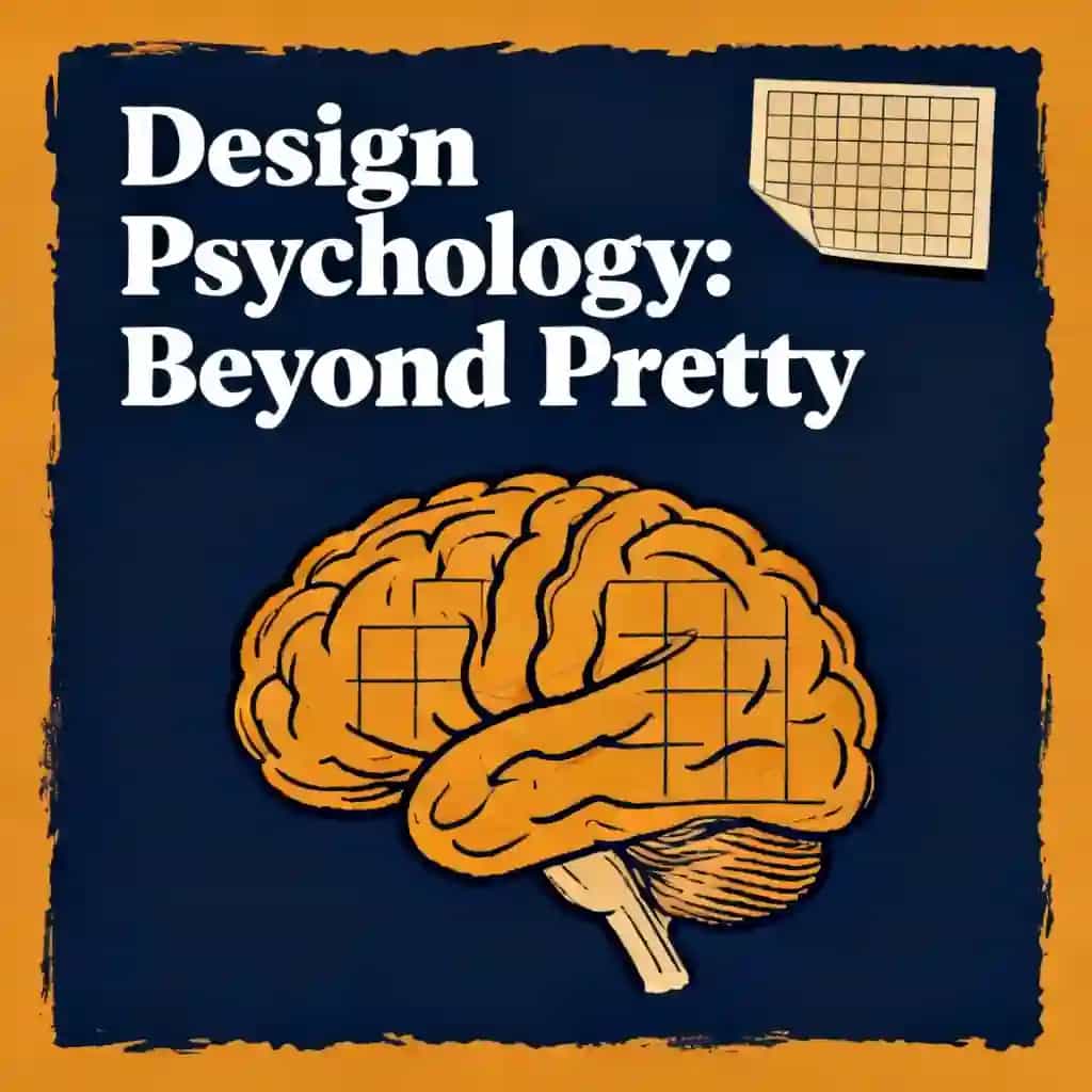
- Vision dominates perception—use contrast and hierarchy to guide attention
- Cognitive load limits memory—chunk information into four-item groups for recall
- Peripheral vision detects motion first—leverage animation for critical alerts
- Storytelling activates brain regions—structure user flows as narrative journeys
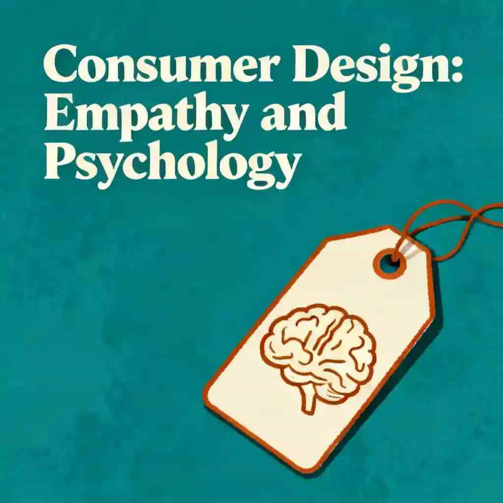
- Intrinsic beats extrinsic motivation—design experiences that satisfy autonomy and mastery
- Defaults reduce decision fatigue but require ethical implementation to prevent bias
- Fear of loss outweighs gain—position calls-to-action as risk mitigation
- Mood dictates decision style—happy users prefer intuitive interfaces
- Choice paralysis strikes at seven options—curate focused selection sets
- Error prevention trumps recovery—build undo paths and confirmation safeguards
- Progressive disclosure maintains flow—reveal complexity through contextual interaction layers
- Face recognition drives trust—strategically place human elements in key zones
《100 Things Every Designer Needs to Know about People》作者介绍
Susan M. Weinschenk is a behavioral psychologist, bestselling author of 100 Things Every Designer Needs to Know About People, and a pioneering figure in applying psychology to user experience design. With a Ph.D. in psychology and over three decades of experience, she bridges cognitive science and practical design strategies, helping professionals create intuitive, human-centered digital products.
Her book—a staple in UX education—explores perception, motivation, and decision-making, drawing from her work with Fortune 1000 companies and her role as Chief Behavioral Scientist at The Team W, her consultancy firm.
Weinschenk’s expertise extends to her other influential works, including Neuro Web Design: What Makes Them Click? and How To Get People To Do Stuff, which delve into behavioral science and persuasive design. A sought-after speaker, she has presented at global conferences like UX Brighton and Convey UX, while her insights shape curricula in design programs and corporate training.
Recognized for translating complex research into actionable guidelines, 100 Things Every Designer Needs to Know About People has been widely adopted by designers and product teams, solidifying its status as a definitive resource in the field.
关于《100 Things Every Designer Needs to Know about People》的常见问题
What is 100 Things Every Designer Needs to Know About People about?
100 Things Every Designer Needs to Know About People by Susan M. Weinschenk bridges psychology and design, offering 100 research-backed principles to create user-centric products. It covers perception, motivation, memory, and decision-making, providing actionable insights for designing intuitive interfaces, websites, and experiences. Each principle is supported by real-world examples and academic references, making complex behavioral science accessible to designers.
Who should read 100 Things Every Designer Needs to Know About People?
This book is ideal for UX/UI designers, web developers, and product managers seeking evidence-based strategies to improve usability and engagement. It’s also valuable for marketers and educators aiming to apply cognitive psychology principles to their work. Beginners gain foundational knowledge, while experienced designers use it as a quick-reference guide.
Is 100 Things Every Designer Needs to Know About People worth reading?
Yes, particularly for designers new to psychology. It distills complex theories into digestible tips, such as optimizing attention-grabbing layouts and reducing decision fatigue. However, seasoned professionals may find some concepts basic, as it prioritizes breadth over depth. The practical examples and citation of peer-reviewed studies add credibility.
What psychological principles does the book emphasize?
Key principles include:
- Peripheral vision dominance: Designing critical elements within central vision.
- Chunking information: Breaking content into smaller units for better recall.
- Intrinsic motivation: Leveraging autonomy and mastery to engage users.
- Cognitive load: Minimizing distractions to reduce decision errors.
How does Susan Weinschenk apply behavioral science to design?
Weinschenk translates neuroscience into actionable design rules, such as using variable rewards (e.g., surprise notifications) to boost engagement. She explains how font choices impact readability and why shorter line lengths improve comprehension. Her focus on storytelling over data helps designers create emotionally resonant experiences.
What design challenges does the book address?
- Attention retention: Using color contrast and motion to guide focus.
- Decision-making: Simplifying choices to avoid paradox of choice.
- Memory limitations: Employing visual hierarchies to aid recall.
- Social validation: Highlighting user testimonials to build trust.
Are there criticisms of 100 Things Every Designer Needs to Know About People?
Some reviewers note the tips can feel superficial for experts, and the focus on web design may limit appeal for other disciplines. The lack of advanced case studies and occasional oversimplification of research are also cited. Despite this, its structured format remains a strength for quick troubleshooting.
What are the key takeaways from the book?
- Design for peripheral vision to capture attention quickly.
- Prioritize intrinsic motivators like curiosity over extrinsic rewards.
- Use storytelling to connect with users emotionally.
- Limit options to 3–4 choices to prevent decision paralysis.
How does the book structure its content for practicality?
The 100 principles are divided into 10 chapters, such as “How People See” and “How People Decide.” Each concept is explained in 1–2 pages with visuals, examples, and direct applications. This modular format lets designers quickly reference topics like typography best practices or error-prevention strategies.
What real-world examples does Susan Weinschenk provide?
- E-commerce: Reducing form fields to increase checkout conversions.
- Education: Using spaced repetition in e-learning modules for better retention.
- Social media: Designing variable-reward systems (e.g., likes, notifications) to drive engagement.
How does the book help designers improve user motivation?
Weinschenk emphasizes aligning designs with intrinsic drivers like autonomy (customizable interfaces) and mastery (progress tracking). She advises against overusing extrinsic rewards (e.g., points), which can reduce long-term engagement. Case studies show how gamification and personalized feedback boost motivation.
Why is 100 Things Every Designer Needs to Know About People relevant in 2025?
With AI-driven interfaces and VR environments requiring deeper user understanding, the book’s psychology-first approach remains critical. Its principles on attention economy and cognitive load are essential for designing voice-activated systems and immersive metaverse experiences. Updated editions could address emerging tech, but the core insights stay foundational.
通过作者的声音感受这本书
将知识转化为引人入胜、富含实例的见解
快速捕捉核心观点,高效学习
以有趣互动的方式享受这本书
《100 Things Every Designer Needs to Know about People》主要人物
- Susan WeinschenkAuthor and expert in psychology and design
- Irving BiedermanPsychologist who developed Geon Theory
《100 Things Every Designer Needs to Know about People》核心主题
- user experience psychology
- visual perception patterns
- human-centered design
- cognitive load optimization
- behavioral design principles
《100 Things Every Designer Needs to Know about People》经典语录
Your brain is constantly playing tricks on you.
Our brains are pattern-making machines.
What designers create isn't necessarily what users perceive.
Forward-facing faces create the strongest emotional connection.
探索你的学习方式
 快速摘要模式
9分钟阅读或收听《100 Things Every Designer Needs to Know about People》摘要
将《100 Things Every Designer Needs to Know about People》的核心观点拆解为易于理解的要点,了解创新团队如何创造、协作和成长。
 趣味模式
趣味模式
《100 Things Every Designer Needs to Know about People》的启示 - 24分钟故事
通过生动的故事体验《100 Things Every Designer Needs to Know about People》,将创新经验转化为令人难忘且可应用的精彩时刻。
 个性化模式
个性化模式
用你自己的学习方式体验《100 Things Every Designer Needs to Know about People》
随时提问,选择你的学习方式,共创真正适合你的洞察。
"Instead of endless scrolling, I just hit play on BeFreed. It saves me so much time."
"I never knew where to start with nonfiction—BeFreed’s book lists turned into podcasts gave me a clear path."
"Perfect balance between learning and entertainment. Finished ‘Thinking, Fast and Slow’ on my commute this week."
"Crazy how much I learned while walking the dog. BeFreed = small habits → big gains."
"Reading used to feel like a chore. Now it’s just part of my lifestyle."
"Feels effortless compared to reading. I’ve finished 6 books this month already."
"BeFreed turned my guilty doomscrolling into something that feels productive and inspiring."
"BeFreed turned my commute into learning time. 20-min podcasts are perfect for finishing books I never had time for."
"BeFreed replaced my podcast queue. Imagine Spotify for books — that’s it. 🙌"
"It is great for me to learn something from the book without reading it."
"The themed book list podcasts help me connect ideas across authors—like a guided audio journey."
"Makes me feel smarter every time before going to work"

下载《100 Things Every Designer Needs to Know about People》摘要
免费获取《100 Things Every Designer Needs to Know about People》摘要的 PDF 或 EPUB 版本。可打印或随时离线阅读。