BeFreed
    Categories>Creativity>Design Principles That Actually Matter

    Design Principles That Actually Matter

    35분
    |
    |
    2026년 2월 10일
    CreativityPsychologyCommunication

    Discover why great design isn't about the tools you use, but the timeless principles that create compelling visuals across any platform or medium.

    Design Principles That Actually Matter
    전달 방식을 선택하세요

    하나의 에피소드, 다양한 청취 방식.

    Design Principles That Actually Matter의 같은 아이디어를 나에게 맞는 목소리, 깊이, 속도로 만나보세요. 언제든 바꿀 수 있습니다.

    전체 대본 및 챕터

    챕터 1

    Tools Don't Make Great Design

    Nia: Hey Miles, I was just scrolling through design portfolios last night, and I noticed something wild – almost every designer I admire seems to be using completely different tools. Some swear by Figma, others are all about Canva, and then there's this whole AI design revolution happening. It's honestly a bit overwhelming!

    Miles: Oh, I totally get that feeling! You know what's fascinating though? I was just reading about how the design landscape has completely transformed. We've gone from needing years of training in complex software to having AI tools that can literally generate professional logos in seconds. But here's the thing – and this might surprise you – the tool isn't what makes great design.

    Nia: Really? I mean, I always thought having the right software was like half the battle.

    Miles: That's exactly the trap most people fall into! It's like thinking a fancy camera automatically makes you a great photographer. The magic happens when you understand the fundamental principles that work across any platform. So let's dive into what actually separates good design from great design, regardless of whether you're using a simple template or building from scratch.

    챕터 2

    The Foundation Isn't What You Think

    Miles: So here's where it gets really interesting, Nia. Most people think design starts with choosing colors or picking fonts, but the real foundation is actually understanding the problem you're solving. It's like—imagine you're building a house and you start with the paint colors before you've even figured out what rooms you need.

    Nia: Oh wow, that's such a perfect analogy! So you're saying we need to step back before we even touch any design tool?

    Miles: Exactly! And this is where design thinking comes in—it's this human-centered approach that completely flips how we approach creative work. Instead of starting with "what should this look like," we start with "who is this for and what do they actually need?"

    Nia: Okay, so walk me through this. How does that actually work in practice?

    Miles: Well, let's say you're designing a poster for a local coffee shop. Most designers would immediately start sketching logos or picking trendy fonts. But design thinking says—hold up. First, go sit in that coffee shop. Watch how people interact with the space. Talk to the owner about their biggest challenges. Maybe you discover that their real problem isn't looking more modern—it's that customers can't figure out how to order during the morning rush.

    Nia: That's brilliant! So the poster might end up being about simplifying the menu or directing traffic flow, not just looking pretty.

    Miles: You've hit the nail on the head! And this connects to something really crucial—the difference between decoration and communication. Great design isn't just about making things beautiful, though beauty certainly matters. It's about creating a visual solution that actually works for real people in real situations.

    Nia: This reminds me of something I experienced last week. I was trying to find the bathroom in this super trendy restaurant, and the signage was so artistic and minimal that I literally couldn't tell which door was which. Beautiful? Absolutely. Functional? Total disaster.

    Miles: Perfect example! That's what happens when we prioritize aesthetics over purpose. The most effective designs find that sweet spot where form and function work together. It's not about choosing one over the other—it's about making them dance together.

    Nia: So how do we actually start building this foundation? Like, what's the first step for someone who wants to think more strategically about their design work?

    Miles: The magic word is empathy. Before you create anything, you need to genuinely understand the people you're designing for. This isn't just about demographics—it's about emotions, frustrations, daily routines, and unspoken needs. You're essentially becoming a detective, gathering clues about human behavior.

    Nia: That sounds like it could take forever though. How do you balance being thorough with actually getting work done?

    Miles: Great question! You don't need to spend months on research. Even spending twenty minutes observing how people interact with existing solutions can reveal incredible insights. The key is asking the right questions and really listening to the answers—not just hearing what confirms what you already think.

    이 에피소드로 더 깊이 배우기

    이 에피소드의 아이디어를 BeFreed의 가이드 학습 경험으로 더 깊이 탐구해 보세요.

    챕터 3

    The Hierarchy That Changes Everything

    Nia: Okay, so we've established this foundation of understanding people first. But once we actually start designing, how do we make sure our message gets across clearly? I feel like I sometimes create designs that look good to me, but then people completely miss the point.

    Miles: You've just touched on one of the most powerful principles in all of visual communication—hierarchy. And here's what's wild about it: your eye is already an expert at reading hierarchy, even if you've never consciously thought about it.

    Nia: What do you mean by that?

    Miles: Think about the last time you glanced at a newspaper or scrolled through a website. Your eye automatically knew where to look first, second, and third, right? That's hierarchy in action. The designers used size, color, position, and contrast to create a visual roadmap for your attention.

    Nia: Oh! So it's like creating a conversation flow, but with visual elements instead of words?

    Miles: Exactly! And just like in conversation, the order matters tremendously. If someone starts telling you a story with the ending first, you're going to be confused. Same thing happens in design—if your hierarchy is backwards or unclear, people get lost.

    Nia: So how do we actually build good hierarchy? Is it just about making important things bigger?

    Miles: Size is definitely one tool, but it's way more nuanced than that. You can create emphasis through contrast—imagine white text on a black background while everything else is black text on white. Or through isolation—placing one element far away from everything else. Or even through color—using a bright red accent in an otherwise neutral palette.

    Nia: I'm starting to see this everywhere now! Like, when I look at movie posters, there's usually the main actor's name at the top, then the title in huge letters, then all the smaller details at the bottom.

    Miles: Perfect observation! And notice how they often use different techniques together—the title might be both the largest AND in a contrasting color AND positioned centrally. They're layering multiple hierarchy signals to make absolutely sure you see it first.

    Nia: But what if everything feels important? I sometimes struggle with clients who want their phone number to be just as prominent as their company name.

    Miles: Oh, the classic "everything is priority one" dilemma! Here's the thing—when everything shouts, nothing gets heard. Part of our job as designers is helping clients understand that hierarchy actually serves their goals better than visual democracy.

    Nia: How do you have that conversation without sounding like you're being difficult?

    Miles: I usually frame it in terms of user behavior. I'll say something like, "Let's think about someone seeing this for the first time. They're going to spend maybe three seconds looking at this. What's the one thing we absolutely need them to remember?" Once they identify that priority, the hierarchy starts to build naturally.

    Nia: That's so smart! You're making them think like their audience instead of like themselves.

    Miles: Exactly! And here's a practical tip that works every time—try the squint test. Literally squint at your design until it's blurry. What elements can you still see clearly? Those are your hierarchy winners. If everything looks like a gray blob, you need to push the contrast further.

    Nia: I love that! It's like an instant hierarchy check. Are there other quick tests like that?

    Miles: Absolutely. The five-second test is gold—show your design to someone for exactly five seconds, then ask them what they remember. If they can't tell you the main message, your hierarchy needs work. Or try the upside-down test—literally flip your design. You should still be able to identify the most important elements based on visual weight alone.

    챕터 4

    Balance Without Boredom

    Nia: You know what's interesting? All this talk about hierarchy makes me think about balance. Like, how do you create emphasis and visual interest without making everything feel chaotic?

    Miles: Oh, you're diving into one of the most elegant aspects of design! Balance is fascinating because it's not just about making things symmetrical—though that's definitely one approach. It's about creating visual stability while keeping things dynamic enough to hold attention.

    Nia: I always thought balance meant everything had to be perfectly centered and even. Is that wrong?

    Miles: Not wrong, just incomplete! That's called symmetrical balance, and it definitely has its place—think wedding invitations or luxury brand logos. But there's also asymmetrical balance, which can be way more engaging. It's like the difference between standing at attention and dancing.

    Nia: Okay, I need a concrete example because I'm having trouble visualizing this.

    Miles: Picture a seesaw. If you put two kids of equal weight on opposite ends, you get perfect symmetrical balance. But what if you put one heavy adult close to the center and one small child at the very end? You can still achieve balance, but now it's more interesting—that's asymmetrical balance.

    Nia: Ah! So in design terms, you might have one large image on the left side balanced by several smaller elements on the right?

    Miles: Exactly! Maybe a big photo on the left, and on the right you have a headline, some text, and a button. The visual weight adds up to create balance, but it's much more dynamic than just centering everything.

    Nia: This is making me think about those Instagram posts that somehow look effortlessly cool. They're probably using asymmetrical balance without even realizing it.

    Miles: Absolutely! And here's where it gets really interesting—balance isn't just about the elements you include, it's also about the spaces between them. White space, or negative space, has its own visual weight.

    Nia: Wait, empty space has weight? How does that work?

    Miles: Think of it like this—imagine you're in a crowded, noisy room versus standing alone in a vast, quiet cathedral. The emptiness in the cathedral actually feels powerful and significant, right? Same thing in design. Strategic empty space can be just as impactful as the elements themselves.

    Nia: That's so counterintuitive! I always feel like I need to fill every corner with something.

    Miles: That's such a common instinct, especially when you're starting out! But here's the thing—white space actually makes your important elements more important. It's like giving them room to breathe and be noticed. Some of the most elegant designs are mostly empty space with just a few perfectly placed elements.

    Nia: So how do you know when you have the right amount of white space versus when it just looks unfinished?

    Miles: Great question! It comes down to intention and proportion. Unfinished feels accidental—like you forgot to add something. Strategic white space feels purposeful. One trick is to look at luxury brands—they're masters of using white space to convey quality and sophistication.

    Nia: I'm thinking of Apple's website now. So much white space, but it never feels empty.

    Miles: Perfect example! Every element has room to be itself, and your eye can focus on what matters without distractions. But here's the key—they're not just randomly leaving space empty. The white space is carefully proportioned and balanced with the content.

    Nia: Are there different types of balance for different purposes? Like, would you balance a punk rock poster the same way you'd balance a law firm's business card?

    Miles: You're thinking like a true designer now! Absolutely not. The punk poster might use chaotic, tension-filled balance—elements that feel like they're about to tip over, creating energy and rebellion. The law firm wants stability and trust, so they'd probably go for more traditional, symmetrical balance.

    Nia: So balance is actually a tool for communicating personality and mood, not just making things look organized?

    Miles: Exactly! Balance is emotional. Symmetrical balance feels calm, stable, trustworthy. Asymmetrical balance feels dynamic, modern, creative. And intentionally off-balance designs can feel energetic, edgy, or urgent. It's all about matching the visual strategy to the message you want to send.

    이 에피소드로 더 깊이 배우기

    이 에피소드의 아이디어를 BeFreed의 가이드 학습 경험으로 더 깊이 탐구해 보세요.

    챕터 5

    Contrast Creates Connection

    Nia: This is all clicking together now! So if hierarchy guides where people look and balance creates the right emotional feel, what makes people actually want to keep looking? Like, what's the difference between a design that's just okay and one that really grabs you?

    Miles: You've just identified the secret weapon of memorable design—contrast! And I'm not just talking about light versus dark colors, though that's part of it. Contrast is about creating visual tension that makes your brain pay attention.

    Nia: Visual tension? That sounds kind of stressful.

    Miles: I know it sounds dramatic, but think about it this way—when everything in a design is similar, your brain basically goes, "Okay, got it," and moves on. But when there's contrast—something unexpected or different—your brain goes, "Wait, what's that?" and suddenly you're engaged.

    Nia: Oh, like when you see a tiny splash of bright yellow in an otherwise black and white photo?

    Miles: Perfect example! That yellow becomes magnetic because it breaks the pattern. Your eye can't help but notice it. And here's what's cool—contrast works on so many levels beyond just color.

    Nia: What do you mean?

    Miles: You can create contrast with size—tiny text next to huge text. With texture—rough next to smooth. With shape—geometric next to organic. With style—modern next to vintage. Each type of contrast creates a different kind of visual interest.

    Nia: I'm starting to understand why some designs feel flat even when they have nice colors and fonts. They might be missing that contrast element.

    Miles: Exactly! It's like the difference between speaking in a monotone voice versus adding emphasis and variation. Both versions might have the same words, but one is way more engaging to listen to.

    Nia: So how do you decide what to make contrasting? Do you just pick random elements?

    Miles: Not random at all! Remember how we talked about hierarchy earlier? Contrast is actually one of the main tools for building hierarchy. You create contrast around the elements you want people to notice most. It's strategic, not decorative.

    Nia: Ah, so if I want people to click a button, I might make it a bright color that contrasts with everything else on the page?

    Miles: Exactly! You're making the desired action impossible to ignore. But here's where it gets sophisticated—you can also use contrast to create relationships between elements. Similar things can have similar contrast levels, while different things get different treatment.

    Nia: Can you give me an example of that?

    Miles: Sure! Imagine a website with three different types of content—main articles, side notes, and calls-to-action. You might give all the main articles the same high-contrast treatment, all the side notes medium contrast, and all the calls-to-action a special bright color. People quickly learn the visual language.

    Nia: That's so smart! You're basically teaching people how to read your design.

    Miles: You got it! And once people understand your visual system, they can navigate your content much more easily. It's like creating a consistent visual vocabulary that makes sense across everything you create.

    Nia: But what if you go too far with contrast? Can things become too different?

    Miles: Absolutely! When everything is trying to be the most contrasting element, you end up with visual chaos. It's like a room where everyone is shouting—nobody gets heard. The key is choosing one or two elements to be your contrast heroes and letting everything else play supporting roles.

    Nia: So it's about being selective with where you create those "wow" moments?

    Miles: Exactly! Think of contrast like seasoning in cooking. A little bit of salt makes everything taste better, but too much salt ruins the whole dish. Strategic contrast enhances your message; random contrast just creates noise.

    챕터 6

    The Psychology Behind Every Choice

    Nia: Okay, this is fascinating, but I have to ask—how much of this is actually science versus just personal preference? Like, when I choose a blue color, am I tapping into some universal psychology, or is it just because I like blue?

    Miles: Oh, you've opened up one of the most intriguing aspects of design! There's definitely real psychology at play, but it's way more nuanced than those "red means passion, blue means trust" charts you see everywhere.

    Nia: Right! I've seen those color psychology infographics, but they always seemed a bit too simple.

    Miles: They are too simple! Here's the thing—color psychology is real, but it's heavily influenced by culture, context, and personal experience. Red might signal danger in one culture and good luck in another. Blue might feel calming on a spa website but cold and distant on a restaurant menu.

    Nia: So how do we actually use psychological principles without falling into oversimplified stereotypes?

    Miles: The key is understanding the deeper psychological mechanisms. For example, people naturally read from left to right in Western cultures, so placing important information on the left side of a design feels more natural. Or the fact that our brains are wired to notice faces and eyes—that's why images with people looking toward your text or call-to-action are so effective.

    Nia: Those feel like principles I can actually use! Are there others like that?

    Miles: Tons! Here's a big one—people process images much faster than text. Your brain can identify an object in an image in about 13 milliseconds, but reading takes much longer. So if you want to communicate quickly, visual symbols and imagery are your friends.

    Nia: That explains why icons are so powerful in interface design!

    Miles: Exactly! And here's another fascinating one—people tend to perceive things that are physically closer together as being related, even if they're completely different. It's called the proximity principle, and it's incredibly useful for organizing information.

    Nia: So if I group related items together visually, people will automatically understand they're connected?

    Miles: You got it! Your brain is constantly looking for patterns and relationships. When you understand how that pattern-recognition works, you can design with it instead of against it.

    Nia: This is making me think about fonts too. Is there psychology behind typography choices?

    Miles: Absolutely! Different typefaces trigger different associations. Serif fonts often feel traditional and trustworthy—that's why newspapers and academic publications love them. Sans-serif fonts feel modern and clean—perfect for tech companies. Script fonts feel personal and elegant—great for wedding invitations.

    Nia: But again, that seems like it could be cultural or generational, right?

    Miles: You're thinking like a true designer! Yes, these associations can shift over time and vary between audiences. That's why the empathy work we talked about earlier is so crucial. You need to understand not just universal psychology, but the specific psychology of your audience.

    Nia: So it's not about memorizing rules, it's about understanding people?

    Miles: Exactly! The psychology gives you a starting point, but observation and testing tell you what actually works for your specific situation. It's like having a map versus actually walking the territory.

    Nia: Are there any psychological principles that seem to work across cultures and contexts?

    Miles: Some basics do seem pretty universal. People notice movement and change. Symmetrical faces are generally considered more attractive. Larger objects feel more important. But even these can be influenced by context and culture, so the best approach is always to stay curious and keep testing your assumptions.

    이 에피소드로 더 깊이 배우기

    이 에피소드의 아이디어를 BeFreed의 가이드 학습 경험으로 더 깊이 탐구해 보세요.

    챕터 7

    Movement That Means Something

    Nia: You mentioned that people notice movement, and that's got me thinking—how do you create a sense of movement in static design? Like, obviously we're not talking about actual animation here.

    Miles: Oh, this is one of my favorite topics! You can absolutely create the illusion of movement and energy in still images, and when you do it well, it makes designs feel alive and engaging instead of flat and static.

    Nia: How is that even possible though? I mean, it's not actually moving.

    Miles: Your brain is incredibly sophisticated at interpreting visual cues for movement, even when nothing is actually moving. Think about a photograph of someone mid-jump—you can feel the energy and motion even though it's a still image, right?

    Nia: Oh yeah! Or like those photos of flowing fabric or hair caught in the wind.

    Miles: Perfect examples! But in graphic design, we can create that same sense of movement through the way we arrange elements, use lines, and guide the eye through a composition.

    Nia: So it's about creating a visual path for people to follow?

    Miles: Exactly! Imagine designing a poster where elements flow from top-left to bottom-right in a diagonal sweep. Even though nothing is moving, your eye follows that path and experiences it as movement. It's like creating a visual journey.

    Nia: That sounds similar to what we talked about with hierarchy—guiding where people look first, second, third.

    Miles: You're making the connection! Movement and hierarchy work together beautifully. You can use directional elements—arrows, lines, or even the way objects are angled—to create a flow that supports your hierarchy. It's like choreographing where attention goes and in what order.

    Nia: Are there specific techniques for creating this kind of visual movement?

    Miles: Absolutely! Diagonal lines create more energy than horizontal or vertical ones. Curved lines feel more organic and flowing. Repetition of elements can create rhythm—like a drumbeat that carries you forward. And implied lines—where elements align to suggest a line even if there isn't one drawn—can guide the eye smoothly through a design.

    Nia: Implied lines? Can you explain that one?

    Miles: Sure! Imagine three photos arranged so their edges line up perfectly. Even though there's no actual line drawn, your eye perceives that alignment as a path to follow. Or think about how a person's gaze in a photo can create an implied line toward whatever they're looking at.

    Nia: That's so subtle but powerful! I bet I've been following implied lines without realizing it.

    Miles: You definitely have! And here's where movement gets really strategic—you can use it to control pacing. Quick, sharp movements feel energetic and urgent. Slow, flowing movements feel calm and elegant. The visual rhythm you create should match the emotional tone you want to convey.

    Nia: So a design for an extreme sports brand might use sharp, dynamic movement, while a luxury spa would use gentle, flowing movement?

    Miles: Perfect! You're thinking about movement as an emotional tool, not just a visual technique. The extreme sports brand might use diagonal lines, bold arrows, and elements that feel like they're breaking out of boundaries. The spa might use soft curves, gentle gradients, and elements that flow like water.

    Nia: This is making me realize that movement is another way to reinforce your brand personality through design.

    Miles: Absolutely! And here's something cool—you can even use the absence of movement strategically. Sometimes, making one element perfectly still while others suggest movement creates incredible focus and impact.

    Nia: Like the calm in the center of a storm?

    Miles: Exactly! It's all about intentional choices. Every element should either contribute to the movement or provide strategic stillness. Nothing should be accidental or arbitrary.

    챕터 8

    Putting It All Into Practice

    Nia: Okay, Miles, my head is spinning with all these principles—hierarchy, balance, contrast, psychology, movement. This all sounds amazing in theory, but how do I actually apply this when I'm staring at a blank canvas or template? Where do I even start?

    Miles: I totally get that feeling! It's like learning to drive—when you're first starting out, you're consciously thinking about every single thing, but eventually it becomes second nature. Let me give you a practical framework that makes this way less overwhelming.

    Nia: Please! I need something concrete I can actually use.

    Miles: Here's what I call the "Five-Minute Foundation"—before you touch any design tools, spend five minutes answering these questions: Who is this for? What's the one thing they need to know or do? What feeling should this create? And what's the context where they'll see this?

    Nia: So you're basically forcing yourself to do that empathy and definition work upfront?

    Miles: Exactly! Because here's what happens when you skip that step—you end up making design decisions based on what looks cool to you, rather than what works for your audience. Those five minutes of thinking save you hours of revisions later.

    Nia: That makes so much sense. What comes after those five minutes?

    Miles: Then you can start with what I call "hierarchy sketching"—literally just draw boxes or scribbles representing your main elements in order of importance. Don't worry about colors or fonts yet. Just figure out what's biggest, what's second biggest, and how they relate to each other spatially.

    Nia: So you're building the skeleton before you add the skin?

    Miles: Perfect analogy! And here's a game-changing tip—do this hierarchy sketch in black and white first. When you can't rely on color to create emphasis, you're forced to use size, position, and spacing more strategically. Color becomes the icing, not the cake.

    Nia: I love that approach! It probably prevents those situations where you think something looks great until you print it in black and white and it falls apart.

    Miles: Exactly! Plus, when you add color later, it becomes much more intentional. You're not just picking pretty colors—you're using color to enhance the hierarchy and mood you've already established.

    Nia: What about when clients want to change everything? How do you handle that without losing all this strategic thinking?

    Miles: Oh, the eternal designer struggle! Here's the thing—when you can explain the reasoning behind your choices, clients usually become collaborators instead of critics. Instead of saying "I think this looks better," you can say "This supports our goal of making the call-to-action impossible to miss."

    Nia: So you're making them partners in the problem-solving process?

    Miles: Exactly! And when they do want changes, you can evaluate them against your original criteria. Does this change help or hurt our hierarchy? Does it reinforce or conflict with the emotional tone we're going for? It turns subjective taste into objective strategy.

    Nia: That's brilliant! Are there any quick checks I can do to make sure I'm applying these principles effectively?

    Miles: Absolutely! Here's my go-to checklist: First, the squint test we talked about—squint at your design and see if the hierarchy still works. Second, show it to someone for five seconds and ask what they remember. Third, ask yourself if the visual choices match the emotional goal. And finally, imagine your design at different sizes—does it still work tiny on a phone screen?

    Nia: Those are such practical reality checks! I can see how they'd catch problems before they become disasters.

    Miles: And here's the secret that nobody talks about—even experienced designers run through these checks. It's not about being perfect on the first try; it's about having a systematic way to evaluate and improve your work.

    Nia: So it's more like having a toolkit than having to be naturally gifted?

    Miles: Absolutely! Design thinking gives you that toolkit. The more you practice using these principles consciously, the more they become intuitive. Eventually, you'll find yourself naturally considering hierarchy and balance and contrast without having to think about it explicitly.

    이 에피소드로 더 깊이 배우기

    이 에피소드의 아이디어를 BeFreed의 가이드 학습 경험으로 더 깊이 탐구해 보세요.

    챕터 9

    Your Design Thinking Playbook

    Nia: This has been such an eye-opening conversation! But I want to make sure our listeners can actually take action on this. Can we create like a practical playbook they can use right away?

    Miles: Absolutely! Let's break this down into concrete steps that anyone can follow, regardless of their experience level or what tools they're using.

    Nia: Perfect! So where should someone start if they want to implement design thinking in their next project?

    Miles: Step one is what I call the "User Reality Check." Before you create anything, spend at least fifteen minutes researching your actual audience. This doesn't mean complicated surveys—it could be as simple as scrolling through their social media, reading reviews of similar products, or asking three people from your target group what frustrates them most about existing solutions.

    Nia: That's so doable! What specific questions should they be asking?

    Miles: Focus on behavior and emotions, not just demographics. Ask things like: "When do you typically need this type of information?" "What's your biggest frustration with how this is currently handled?" "How much time do you usually have when you're dealing with this?" These questions reveal context that completely changes your design approach.

    Nia: I love that you're focusing on the situation, not just the person. What's step two?

    Miles: Step two is the "One Thing Rule." After your research, complete this sentence: "The one thing my audience needs to know, feel, or do is..." If you can't complete that sentence in ten words or less, your focus is too broad.

    Nia: That's such a good constraint! It forces you to prioritize instead of trying to communicate everything at once.

    Miles: Exactly! And here's step three—create what I call a "Mood and Function Board." This isn't about pretty inspiration images. Collect examples that match both the emotional tone you want and the functional requirements you have. So if you're designing something that needs to feel trustworthy and also be scannable quickly, find examples that nail both criteria.

    Nia: So you're looking for designs that solve similar problems, not just designs that look cool?

    Miles: You got it! Step four is the "Hierarchy Sketch"—before you open any design software, sketch your layout with simple shapes. Literally just rectangles and circles representing your elements. Make the most important thing the biggest, and arrange everything else in order of priority.

    Nia: This is keeping everything so strategic! What about the actual design execution?

    Miles: Step five is "Design in Grayscale First." Start with black, white, and gray only. Get your hierarchy, balance, and spacing working perfectly before you add any color. This prevents color from becoming a crutch and ensures your design works on a structural level.

    Nia: That makes so much sense! I bet it also makes the color choices more intentional when you do add them.

    Miles: Absolutely! Step six is "Test Early and Often." Show your work to real people from your target audience at multiple stages. Not for final approval, but for understanding. Ask them to describe what they see and what they think it's for. Their responses will tell you if your visual communication is actually working.

    Nia: Are there any specific testing questions that work well?

    Miles: Yes! Try these: "What's the first thing you notice?" "What do you think this is trying to help you do?" "How does this make you feel?" And here's a crucial one: "What questions do you have after looking at this?" Their questions reveal gaps in your communication.

    Nia: That last one is genius! What's the final step in the playbook?

    Miles: Step seven is "Iterate with Purpose." When you make changes based on feedback, don't just randomly adjust things. Go back to your original user research and "one thing" goal. Ask yourself: "Does this change help my audience accomplish their goal more easily?" Every revision should have a clear strategic reason.

    Nia: So you're treating each iteration as a hypothesis test, not just a style preference?

    Miles: Exactly! And here's a bonus tip—document your decisions. Write down why you chose certain colors, fonts, or layouts. This helps you stay consistent across projects and also helps you explain your choices to clients or team members.

    Nia: This playbook feels so actionable! Is there a quick daily practice that can help people get better at design thinking?

    Miles: Yes! Spend five minutes each day analyzing one piece of design you encounter—a poster, website, app screen, whatever. Ask yourself: "Who is this for? What's it trying to accomplish? What design choices support that goal?" This trains your eye to see design strategically, not just aesthetically.

    Nia: I love that! It's like building your design thinking muscles through observation.

    Miles: Exactly! And the more you practice seeing design as problem-solving rather than decoration, the more natural it becomes to approach your own work that way. Design thinking isn't just a process—it's a mindset shift that makes everything you create more effective and meaningful.

    챕터 10

    The Future of Thoughtful Design

    Nia: As we wrap this up, I'm curious about something. We've talked a lot about timeless principles, but design tools and trends are changing so fast. How does design thinking help us navigate that constant evolution?

    Miles: That's such an important question, especially right now! You know what's fascinating? The more technology advances, the more valuable these human-centered principles become. AI can generate a logo in seconds, but it can't do that user research. It can't sit in a coffee shop and observe how people actually behave.

    Nia: Right! So the human insight part becomes even more crucial as the technical barriers get lower?

    Miles: Exactly! Think about it—when anyone can create something that looks professionally designed, what separates good work from great work? It's whether that design actually solves a real problem for real people. The tools are becoming democratized, but the thinking behind effective design is becoming more valuable than ever.

    Nia: That's actually really encouraging! It means that focusing on these fundamentals isn't just about getting better at current tools—it's about building skills that will stay relevant no matter what new technology emerges.

    Miles: Absolutely! And here's what excites me most—design thinking principles can actually help us use new tools more effectively. When you understand hierarchy and contrast and user psychology, you can prompt AI tools more strategically, evaluate their output more critically, and iterate more purposefully.

    Nia: So instead of being replaced by technology, designers who think strategically can actually leverage technology to work faster and test more ideas?

    Miles: You've hit the nail on the head! I see designers using AI to rapidly prototype multiple concepts, then applying design thinking principles to evaluate which directions are worth developing further. The technology amplifies the thinking, rather than replacing it.

    Nia: What advice would you give to someone who's just starting their design journey in this rapidly changing landscape?

    Miles: Focus on becoming a great problem-solver first, and a tool expert second. Learn the principles we've discussed today—empathy, hierarchy, balance, contrast—because those will serve you regardless of whether you're working in Canva, Figma, or whatever gets invented next year.

    Nia: And probably stay curious about people, right? Since that seems to be at the heart of everything we've talked about.

    Miles: Absolutely! The best designers I know are endlessly curious about human behavior. They notice how people interact with signs, websites, packaging, everything. That observational skill is something no AI can replicate, and it's what makes design work truly effective.

    Nia: This has been such a rich conversation, Miles. For everyone listening, I hope you're feeling inspired to approach your next design project—whether it's a simple social media post or a complete brand identity—with this more strategic, human-centered mindset.

    Miles: And remember, you don't have to master everything at once! Pick one principle from today's discussion and focus on that in your next project. Maybe it's starting with better user research, or maybe it's that five-second hierarchy test. Small, consistent improvements in how you think about design will compound into dramatically better results over time.

    Nia: Thanks so much for sharing your insights today, Miles. And to everyone who's been listening, we'd love to hear about your design thinking experiments! What principles resonated most with you, and how are you planning to apply them? Keep learning, keep creating, and most importantly, keep thinking about the humans behind every design challenge.

    Miles: Until next time, remember—great design isn't about having the fanciest tools or following the latest trends. It's about understanding people deeply and solving their problems beautifully. Happy designing, everyone!

    ★★★★★

    Design Principles That Actually Matter의 끝까지 도달했어요

    “23일째 매일 사용하고 있어요. 이제 제 일상의 한 부분이 되었습니다.”

    jayallen

    Design Principles That Actually Matter 베스트 인용

    “

    Great design isn't just about making things beautiful; it's about creating a visual solution that actually works for real people in real situations.

    ”
    K

    Generated by K

    질문 입력

    design

    호스트 음성
    Niaplay
    Milesplay
    지식 출처
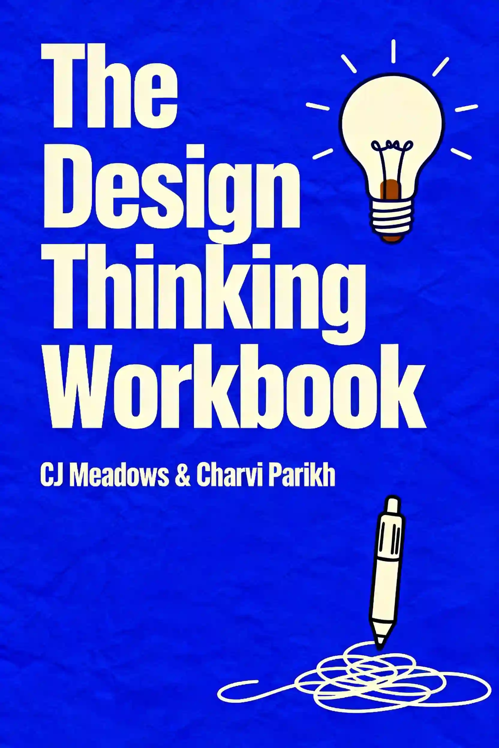
    Design Thinking Workbook
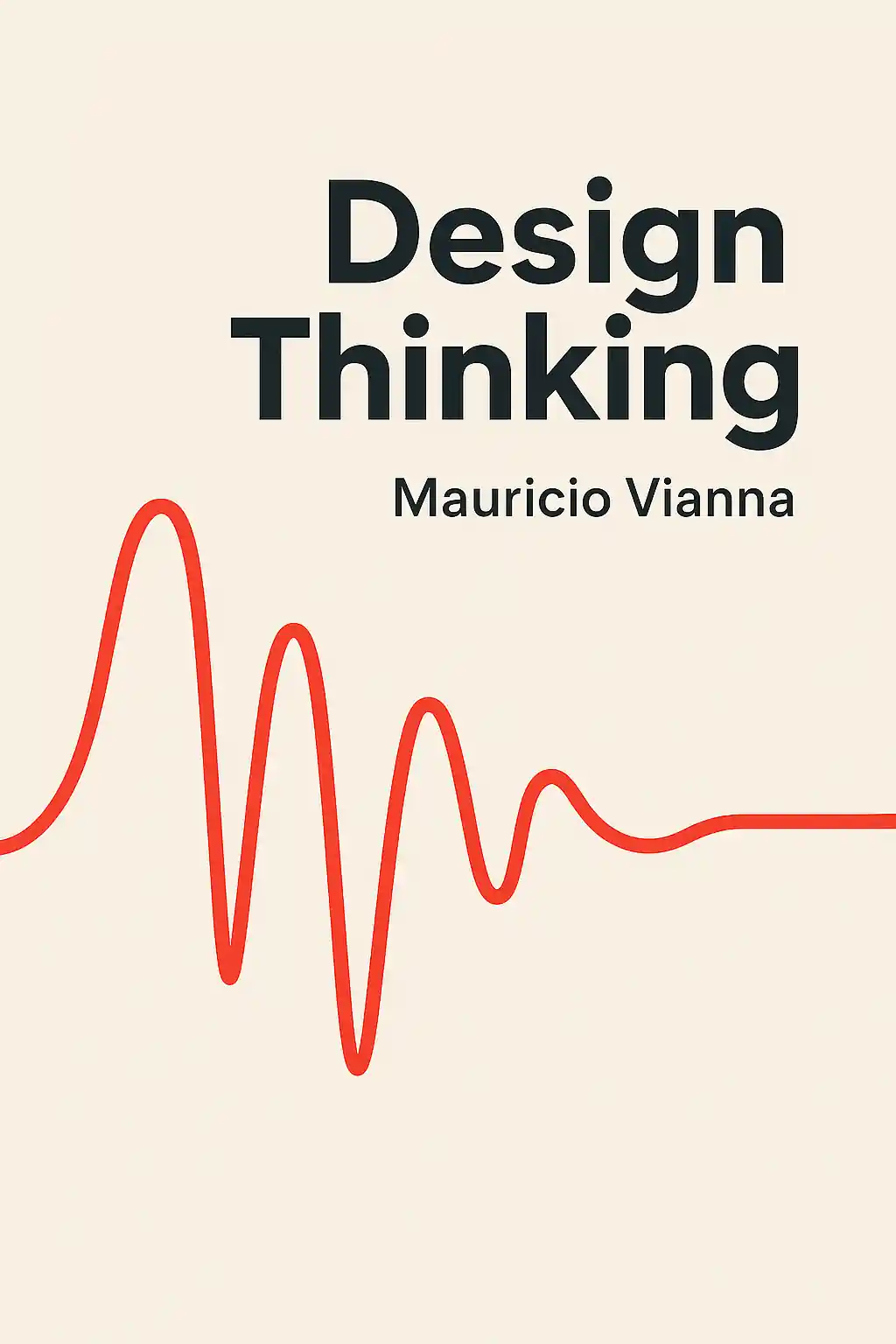
    Design Thinking
    Change by Design
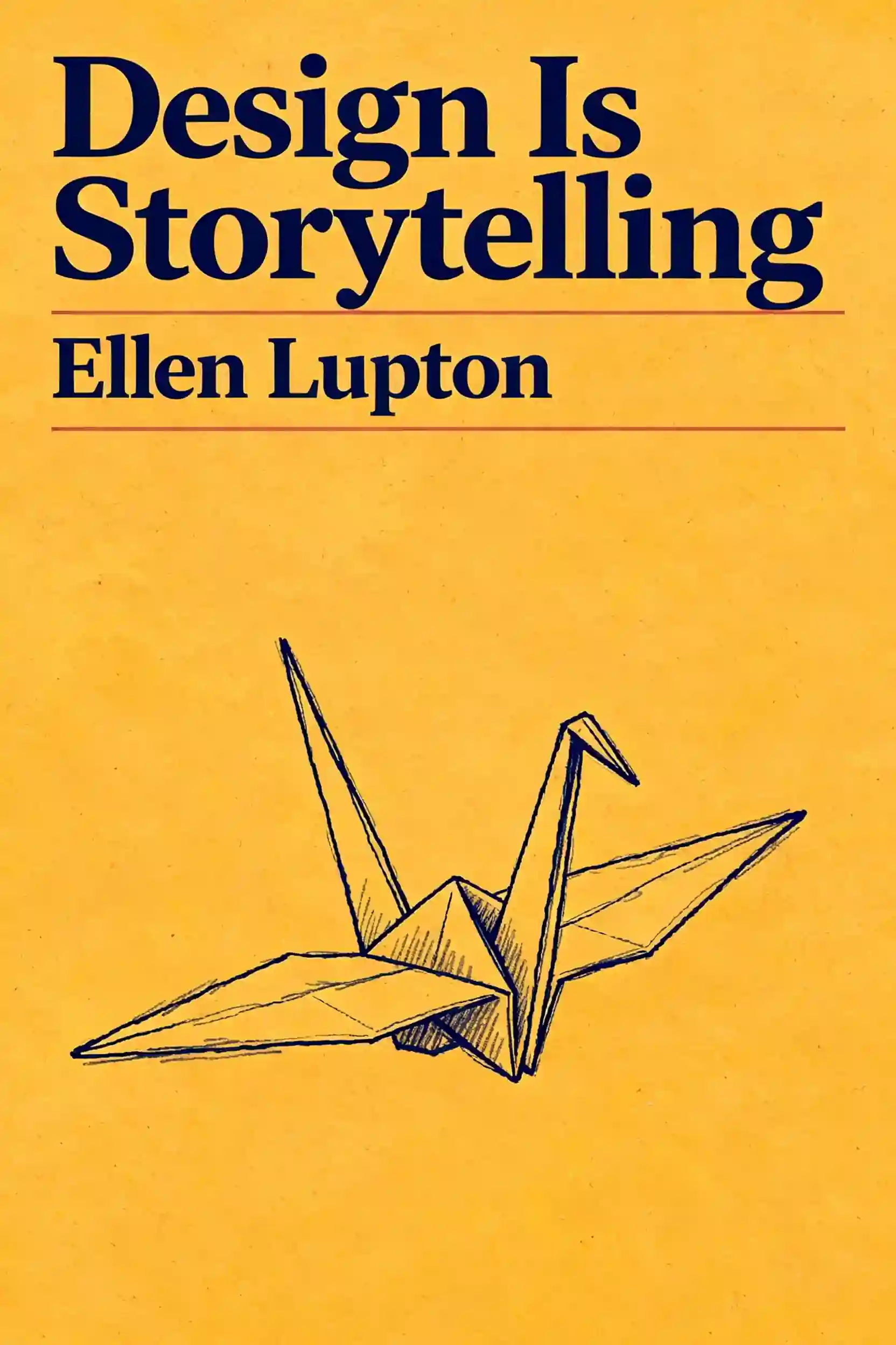
    Design is storytelling
    Value Proposition Design
    UX Strategy

    컬럼비아 대학교 동문들이 제작 | 샌프란시스코에서 개발

    BeFreed는 호기심 넘치는 글로벌 커뮤니티를 하나로 연결합니다

    4.7

    평균 평점

    앱 평가 7.84천 개 이상

    BeFreed 커뮤니티

    정말이지 아직 앱을 다 써 보지도 않았는데, 며칠 써 본 것만으로도 깊은 인상을 받았어요… BeFreed는 제가 써 본 어떤 학습 앱과도 차원이 달라요. 몰입감이 엄청나고 집중력도 실제로 좋아져서, 스마트폰을 하염없이 스크롤하는 분들께 딱이에요!

    @ladyInfinity

    정확히 23일 전에 BeFreed를 구입했는데, 그날부터 하루도 빠짐없이 쓰고 있어요. 제 일상 업무 흐름과 학습 습관에 완전히 자리 잡았어요.

    @jayallen

    솔직히 이 앱은 제 기대를 전부 뛰어넘었어요. 어떤 주제든 오디오로 만들어 달라고 할 수 있고, 결과물이 놀라워요. 제 전문 분야는 심리치료 쪽이고 여러 학문이 얽혀 있는데도 답변이 아주 정확해요.

    @Raguipa

    제일 고마운 건 스크롤하는 시간이 확 줄었다는 거예요. 검색하는 시간은 줄고 흡수하는 시간은 늘었어요. 오디오북 전권, 팟캐스트, 학습 플랜의 조합이 정말 훌륭해요.

    @colonyofcreatorsNGO

    저는 24년째 PhotoReading 속진 학습 강사로 일하고 있어요… 책과 독서, 배움이 제 전문인데, BeFreed는 정보를 소화하기 쉽게 전달하는 혁신적인 방식을 정말 잘 구현했어요.

    @BeFreed user

    단순한 책 요약 앱이 아니에요. '재미' 스타일을 써 봤는데, 전통적인 방식보다 훨씬 나은 요약이고 아이디어를 이해하기도 쉬워요. 이것만으로도 값어치를 해요.

    @austinakon

    이 앱이 정말 좋아요. 며칠 써 봤는데 듣는 걸 멈출 수가 없어요. 시작하기에 이보다 좋을 수 없어요.

    @jcrules328

    정말 마음에 들어요. 한 달 정도 써 봤는데 숨은 보석을 찾은 기분이에요. BeFreed로 제가 원하는 주제를 직접 만들 수 있어서 좋고, 목소리도 훌륭한 데다 내레이션 선택지가 무궁무진해요.

    @DanielCZ

    정말이지 아직 앱을 다 써 보지도 않았는데, 며칠 써 본 것만으로도 깊은 인상을 받았어요… BeFreed는 제가 써 본 어떤 학습 앱과도 차원이 달라요. 몰입감이 엄청나고 집중력도 실제로 좋아져서, 스마트폰을 하염없이 스크롤하는 분들께 딱이에요!

    @ladyInfinity

    정확히 23일 전에 BeFreed를 구입했는데, 그날부터 하루도 빠짐없이 쓰고 있어요. 제 일상 업무 흐름과 학습 습관에 완전히 자리 잡았어요.

    @jayallen

    솔직히 이 앱은 제 기대를 전부 뛰어넘었어요. 어떤 주제든 오디오로 만들어 달라고 할 수 있고, 결과물이 놀라워요. 제 전문 분야는 심리치료 쪽이고 여러 학문이 얽혀 있는데도 답변이 아주 정확해요.

    @Raguipa

    제일 고마운 건 스크롤하는 시간이 확 줄었다는 거예요. 검색하는 시간은 줄고 흡수하는 시간은 늘었어요. 오디오북 전권, 팟캐스트, 학습 플랜의 조합이 정말 훌륭해요.

    @colonyofcreatorsNGO

    저는 24년째 PhotoReading 속진 학습 강사로 일하고 있어요… 책과 독서, 배움이 제 전문인데, BeFreed는 정보를 소화하기 쉽게 전달하는 혁신적인 방식을 정말 잘 구현했어요.

    @BeFreed user

    단순한 책 요약 앱이 아니에요. '재미' 스타일을 써 봤는데, 전통적인 방식보다 훨씬 나은 요약이고 아이디어를 이해하기도 쉬워요. 이것만으로도 값어치를 해요.

    @austinakon

    이 앱이 정말 좋아요. 며칠 써 봤는데 듣는 걸 멈출 수가 없어요. 시작하기에 이보다 좋을 수 없어요.

    @jcrules328

    정말 마음에 들어요. 한 달 정도 써 봤는데 숨은 보석을 찾은 기분이에요. BeFreed로 제가 원하는 주제를 직접 만들 수 있어서 좋고, 목소리도 훌륭한 데다 내레이션 선택지가 무궁무진해요.

    @DanielCZ

    유용한 정보와 아이디어를 8~15분짜리 팟캐스트 스타일 오디오로 압축해서 들을 수 있다는 게 정말 좋아요. 원래 팟캐스트는 군더더기가 많아서 안 좋아했는데, 여기는 그걸 싹 걷어냈어요.

    @BeFreed user

    박사 과정을 마무리하는 중이라 낯선 자료를 많이 읽어야 해요… BeFreed에서는 프롬프트만 입력하면 앱이 자료를 찾아서 오디오 팟캐스트로 만들어 줘요. BeFreed의 과정이 NotebookLM보다 더 매끄럽게 느껴져요.

    @Brad

    아침을 준비하거나 산책하거나 출퇴근할 때 들을 것을 YouTube에서 자주 찾곤 했는데, BeFreed는 광고도 군더더기도 없이 훨씬 더 딱 맞는 걸 들려줘요!

    @BeFreed user

    이 플랫폼의 가장 큰 장점은 활용도예요. 다루지 못하는 주제가 말 그대로 하나도 없어요. 무엇을 던져도 다 소화해요… 제한이 전혀 없으면서 약속을 실제로 지키는 학습 도구는 정말 드물어요.

    @jayallen

    BeFreed는 환상적이에요. 디자인이 편해서 헤매는 시간은 줄고 배우는 시간은 늘었어요. 오디오북, 팟캐스트, 학습 플랜의 조합은 천재적이에요. 제 하루가 완전히 달라졌어요.

    @BeFreed user

    처음엔 이탈리아어로 팟캐스트를 만드는 방법을 이해하는 데 시간이 좀 걸렸는데, 알고 나니까 — 와! 정말 대단해요! 어떤 주제든 설명해 달라고 하면 정말 똑똑하게 잘 설명해 줘요!

    @matteo77

    BeFreed는 제가 매일 쓰는 오디오북 앱이 됐어요… 제일 마음에 드는 건 텍스트를 넣으면 이동 중에도 들을 수 있는 오디오로 만들어 준다는 점이에요.

    @kotanzu1

    유용한 정보와 아이디어를 8~15분짜리 팟캐스트 스타일 오디오로 압축해서 들을 수 있다는 게 정말 좋아요. 원래 팟캐스트는 군더더기가 많아서 안 좋아했는데, 여기는 그걸 싹 걷어냈어요.

    @BeFreed user

    박사 과정을 마무리하는 중이라 낯선 자료를 많이 읽어야 해요… BeFreed에서는 프롬프트만 입력하면 앱이 자료를 찾아서 오디오 팟캐스트로 만들어 줘요. BeFreed의 과정이 NotebookLM보다 더 매끄럽게 느껴져요.

    @Brad

    아침을 준비하거나 산책하거나 출퇴근할 때 들을 것을 YouTube에서 자주 찾곤 했는데, BeFreed는 광고도 군더더기도 없이 훨씬 더 딱 맞는 걸 들려줘요!

    @BeFreed user

    이 플랫폼의 가장 큰 장점은 활용도예요. 다루지 못하는 주제가 말 그대로 하나도 없어요. 무엇을 던져도 다 소화해요… 제한이 전혀 없으면서 약속을 실제로 지키는 학습 도구는 정말 드물어요.

    @jayallen

    BeFreed는 환상적이에요. 디자인이 편해서 헤매는 시간은 줄고 배우는 시간은 늘었어요. 오디오북, 팟캐스트, 학습 플랜의 조합은 천재적이에요. 제 하루가 완전히 달라졌어요.

    @BeFreed user

    처음엔 이탈리아어로 팟캐스트를 만드는 방법을 이해하는 데 시간이 좀 걸렸는데, 알고 나니까 — 와! 정말 대단해요! 어떤 주제든 설명해 달라고 하면 정말 똑똑하게 잘 설명해 줘요!

    @matteo77

    BeFreed는 제가 매일 쓰는 오디오북 앱이 됐어요… 제일 마음에 드는 건 텍스트를 넣으면 이동 중에도 들을 수 있는 오디오로 만들어 준다는 점이에요.

    @kotanzu1

    웹에서 BeFreed가 어떻게 논의되고 있는지 더 보기
    129.7K19.5K
    55.2K19.2K
    154.2K10827355
    48.1K2.5K
    81.2K6.6K
    82.3K1.8K
    지금 바로 학습 여정을 시작하세요
    BeFreed 앱
    BeFreed

    무엇이든 개인화된 학습

    DiscordLinkedIn
    추천 도서 요약
    Crucial ConversationsThe Perfect MarriageInto the WildNever Split the DifferenceAttachedGood to GreatSay Nothing
    인기 카테고리
    Self HelpCommunication SkillRelationshipMindfulnessPhilosophyInspirationProductivity
    유명인 추천 도서
    Elon MuskCharlie KirkBill GatesSteve JobsAndrew HubermanJoe RoganJordan Peterson
    수상작 컬렉션
    Pulitzer PrizeNational Book AwardGoodreads Choice AwardsNobel Prize in LiteratureNew York TimesCaldecott MedalNebula Award
    추천 주제
    ManagementAmerican HistoryWarTradingStoicismAnxietySex
    연도별 베스트 도서
    2025 Best Non Fiction Books2024 Best Non Fiction Books2023 Best Non Fiction Books
    추천 저자
    Chimamanda Ngozi AdichieGeorge OrwellO. J. SimpsonBarbara O'NeillWinston ChurchillCharlie Kirk
    BeFreed vs 다른 앱
    BeFreed vs. Other Book Summary AppsBeFreed vs. ElevenReaderBeFreed vs. ReadwiseBeFreed vs. Anki
    학습 도구
    Knowledge VisualizerAI Podcast Generator
    정보
    회사 소개arrow
    가격arrow
    FAQarrow
    블로그arrow
    채용arrow
    파트너십arrow
    앰배서더 프로그램arrow
    디렉토리arrow
    BeFreed
    Try now
    © 2026 BeFreed
    이용 약관개인정보 처리방침
    BeFreed

    무엇이든 개인화된 학습

    DiscordLinkedIn
    추천 도서 요약
    Crucial ConversationsThe Perfect MarriageInto the WildNever Split the DifferenceAttachedGood to GreatSay Nothing
    인기 카테고리
    Self HelpCommunication SkillRelationshipMindfulnessPhilosophyInspirationProductivity
    유명인 추천 도서
    Elon MuskCharlie KirkBill GatesSteve JobsAndrew HubermanJoe RoganJordan Peterson
    수상작 컬렉션
    Pulitzer PrizeNational Book AwardGoodreads Choice AwardsNobel Prize in LiteratureNew York TimesCaldecott MedalNebula Award
    추천 주제
    ManagementAmerican HistoryWarTradingStoicismAnxietySex
    연도별 베스트 도서
    2025 Best Non Fiction Books2024 Best Non Fiction Books2023 Best Non Fiction Books
    학습 도구
    Knowledge VisualizerAI Podcast Generator
    추천 저자
    Chimamanda Ngozi AdichieGeorge OrwellO. J. SimpsonBarbara O'NeillWinston ChurchillCharlie Kirk
    BeFreed vs 다른 앱
    BeFreed vs. Other Book Summary AppsBeFreed vs. ElevenReaderBeFreed vs. ReadwiseBeFreed vs. Anki
    정보
    회사 소개arrow
    가격arrow
    FAQarrow
    블로그arrow
    채용arrow
    파트너십arrow
    앰배서더 프로그램arrow
    디렉토리arrow
    BeFreed
    Try now
    © 2026 BeFreed
    이용 약관개인정보 처리방침

    비슷한 콘텐츠

    Design Principles That Actually Matter 책 표지
    The Design Thinking WorkbookChange by DesignDesign thinkingDesigning Your Life
    28 sources
    Design Principles That Actually Matter
    Discover why having powerful design tools isn't enough - learn the fundamental principles that separate amateur work from professional design, even when using the same software as everyone else.
    32 min
    Design Is More Than Making Things Look Pretty 책 표지
    The Design of Everyday ThingsDesign Is StorytellingVisual ThinkingUser Friendly
    22 sources
    Design Is More Than Making Things Look Pretty
    Struggling to stand out in a crowded feed? Learn how to use visual hierarchy and consistency to guide user behavior and build a brand that works.
    22 min
    Why Design Is More Than Just Looking Good 책 표지
    The Design of Everyday ThingsUser FriendlyVisual ThinkingDesign Is Storytelling
    28 sources
    Why Design Is More Than Just Looking Good
    Struggling to make your ideas functional? Learn how invisible design and cognitive load help you solve problems and build better user experiences.
    30 min
    The Psychology of Great Design: Beyond Pretty 책 표지
    Designing the MindHappiness By DesignWhy Design Matters
    3 sources
    The Psychology of Great Design: Beyond Pretty
    Discover how design principles transform everything from products to personal habits. Learn to design with purpose, iterate based on real feedback, and create meaningful experiences that align with your deepest values.
    8 min
    10 Essential UX Principles That Actually Work 책 표지
    Don't Make Me Think, RevisitedUX Design Principles: The 10 Rules Behind Products Users LoveLaws of UX7 fundamental UX design principles all designers should know
    6 sources
    10 Essential UX Principles That Actually Work
    Discover the psychology-backed UX principles from industry legends like Steve Krug and Jakob Nielsen that separate beloved products from rage-quit disasters. Learn practical strategies to design interfaces that feel invisible and intuitive.
    8 min
    Design: Beyond Pretty Things 책 표지
    The Design of Everyday ThingsDo Design100 Things Every Designer Needs to Know About PeopleThe Design Thinking Workbook
    28 sources
    Design: Beyond Pretty Things
    Discover what design really means beyond aesthetics - it's a systematic problem-solving methodology you can apply to everything from organizing your closet to launching a business.
    28 min
    Becoming a Great Designer: Beyond Pretty Pictures 책 표지
    source 1source 2source 3source 4
    6 sources
    Becoming a Great Designer: Beyond Pretty Pictures
    Discover what it truly takes to excel as a designer - from mastering storytelling and user empathy to navigating business realities and building sustainable creative careers.
    10 min
    Design Beyond Aesthetics: Balance, AI, and Human Connection 책 표지
    Think Like a UX ResearcherLaws of UX100 Things Every Designer Needs to Know About PeopleEmotional Design
    25 sources
    Design Beyond Aesthetics: Balance, AI, and Human Connection
    Explore the core principles of visual balance and Human-Centered Design. Learn how to leverage AI tools and grid systems to transform chaotic visuals into compelling, user-focused digital experiences.
    32 min

    Recommended Learning Plans

    design!
    학습 계획

    design!

    This comprehensive design learning path is essential for anyone looking to build or elevate their design career in today's innovation-driven landscape. It's ideal for aspiring designers seeking structured skill development, product managers wanting to think more like designers, entrepreneurs needing to create user-centered solutions, and experienced designers aiming to reach strategic leadership levels. The curriculum bridges foundational knowledge with cutting-edge practice, ensuring you're prepared for both current design challenges and future AI-integrated workflows.

    4 h 29 m•4 섹션
    Systems Thinking for UI/UX Design
    학습 계획

    Systems Thinking for UI/UX Design

    This learning plan is essential for designers looking to move beyond surface-level aesthetics to solve complex organizational challenges. It is ideal for UI/UX professionals and product designers who want to master the intersection of human-centered design, iterative prototyping, and AI-driven scalability.

    2 h 30 m•5 섹션
    Learn about product design
    학습 계획

    Learn about product design

    Product design is the cornerstone of creating solutions that truly resonate with users while achieving business objectives. This learning plan equips professionals with the essential skills to create intuitive, innovative products through user-centered methodologies and strategic thinking.

    4 h 48 m•4 섹션
    design leader mindset
    학습 계획

    design leader mindset

    Design leaders today must navigate beyond craft excellence to drive strategic business impact and cultural transformation. This learning plan is essential for experienced designers moving into leadership roles, current design managers seeking to elevate their strategic influence, and organizational leaders who want to build design-led cultures that foster innovation and deliver exceptional user experiences.

    3 h 57 m•4 섹션
    Design leadership on social
    학습 계획

    Design leadership on social

    This learning path is essential for design leaders and aspiring executives who want to make an impact in the social media space. It combines foundational design thinking with advanced leadership skills specific to social platforms, where design decisions affect millions of users and shape how people connect and communicate. Perfect for senior designers, design managers, and product leaders working at social companies or any organization building community-driven digital experiences.

    4 h 46 m•4 섹션
    The Architect's Metaphysical Toolkit
    학습 계획

    The Architect's Metaphysical Toolkit

    This toolkit is essential for thinkers and designers who want to move beyond surface-level aesthetics into the structural logic of reality. It benefits architects, philosophers, and systems designers seeking to build worlds that harmonize mind, matter, and diverse cultural perspectives.

    2 h•4 섹션
    Improve user experience and accessibility
    학습 계획

    Improve user experience and accessibility

    In today's digital landscape, creating products that are both functional and inclusive is a critical competitive advantage. This path is ideal for designers and product managers looking to bridge the gap between basic usability and strategic, accessible user-centered design.

    4 h 51 m•4 섹션
    The Design Student's Social Playbook
    학습 계획

    The Design Student's Social Playbook

    This plan is essential for design students who want to bridge the gap between academic theory and real-world social influence. It benefits emerging creatives looking to build professional authority while remaining authentic to modern digital culture.

    2 h•5 섹션