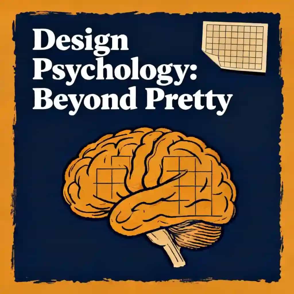
Laws of UX: Using Psychology to Design Better Products & Services
Aperçu de Laws of UX
Discover the psychology behind intuitive design in "Laws of UX," the globally translated design bible that transformed how tech giants build products. Ever wondered why some interfaces feel effortlessly natural while others frustrate? Yablonski's principles reveal the invisible forces shaping every digital interaction.
- Jakob’s Law demands familiar navigation patterns to reduce cognitive friction.
- Hick’s Law proves fewer choices accelerate user decision-making speed.
- Aesthetic-Usability Effect ties visual appeal to perceived functionality.
- Design for quick actions with Miller’s 7±2 memory limit.
- Paradox of Active User: skip tutorials for intuitive interfaces.
- Leverage Gestalt principles to make complex systems feel unified.
- Ethical persuasion balances behavioral nudges with user autonomy.
- Cognitive load drops when interfaces mimic real-world mental models.
- Fitts’ Law prioritizes large click targets for error reduction.
- Yablonski argues ethical design outlives dark patterns long-term.
- Progressive disclosure simplifies tasks by hiding non-essential options.
- Human cognitive blueprint shapes UX more than design trends.
À propos de l'auteur de Laws of UX
Jon Yablonski is a Senior Product Designer at Mixpanel and author of Laws of UX: Using Psychology to Design Better Products & Services, recognized for bridging cognitive psychology with practical user experience design.
A veteran in digital product design, Yablonski developed his expertise through roles at General Motors crafting in-vehicle interfaces and currently shapes data-driven experiences at Mixpanel. His book distills complex psychological principles like Hick's Law and Jakob's Law into actionable frameworks for creating intuitive interfaces, informed by his decade of industry experience.
Beyond writing, Yablonski built the award-winning Laws of UX resource platform—visited over 2.5 million times—and co-organizes the IXD2 design conference. He also created Humane by Design, a guide for ethical technology design. Translated into Portuguese and Japanese, Laws of UX has become essential reading in university design curricula and tech company onboarding programs worldwide.
FAQ sur Laws of UX
What is Laws of UX by Jon Yablonski about?
Laws of UX explains how psychological principles like Hick’s Law and the von Restorff Effect shape user behavior, offering designers a framework to build intuitive digital experiences. It distills academic research into 21 practical laws, organized into heuristic guidelines, cognitive biases, perceptual principles, and ethical considerations.
Who should read Laws of UX?
UX/UI designers, product managers, and developers seeking to align interfaces with human cognition will benefit most. It’s also valuable for students learning design psychology or professionals aiming to justify design decisions using behavioral science.
Is Laws of UX worth reading in 2025?
Yes—the book remains a cornerstone for human-centered design, with timeless principles applicable to emerging technologies like AI interfaces and AR/VR. Its focus on cognitive psychology ensures relevance despite evolving design trends.
How is Laws of UX structured?
The 190-page book divides 21 laws into four categories: Heuristic Laws (e.g., Jakob’s Law), Gestalt Principles (e.g., similarity), Cognitive Biases (e.g., peak-end rule), and Design Ethics (e.g., Tesler’s Law). Each chapter defines a law, provides examples (e.g., e-commerce layouts), and offers application tips.
What are the key UX laws in the book?
- Jakob’s Law: Users prefer familiar interfaces, so follow established patterns.
- Hick’s Law: Decision time increases with options—simplify choices.
- Aesthetic-Usability Effect: Visually appealing designs are perceived as easier to use.
How does Laws of UX address cognitive biases?
It explores biases like the peak-end rule (users recall peak and final experiences) and Miller’s Law (working memory limits), showing how to structure content into digestible chunks and prioritize impactful interactions.
What is Tesler’s Law in Laws of UX?
Tesler’s Law states that every system has inherent complexity designers cannot eliminate. The book advises balancing simplicity by offloading complexity to the system (e.g., automating form fields) rather than the user.
Does Laws of UX cover ethical design?
Chapter 11, “With Power Comes Responsibility,” emphasizes ethical considerations like avoiding dark patterns and ensuring accessibility. Yablonski argues that understanding psychology obligates designers to prioritize user well-being.
How does Laws of UX compare to Don’t Make Me Think?
While both focus on usability, Laws of UX delves deeper into psychology-driven frameworks, whereas Steve Krug’s classic emphasizes heuristic evaluations. They’re complementary—Krug’s book offers methods, Yablonski’s explains underlying principles.
What criticisms exist about Laws of UX?
Some note the laws oversimplify complex behaviors or lack original research. However, most praise the book for making academic concepts accessible and actionable for practitioners.
Can Laws of UX help with mobile app design?
Yes. For example, applying Fitts’s Law (target size/distance) improves button placement, and Postel’s Law (robustness) ensures apps handle input errors gracefully.
Why is Laws of UX relevant to AI design?
As AI interfaces grow, understanding cognitive biases like the Doherty Threshold (system responsiveness) ensures seamless human-AI interactions. The book’s focus on mental models aids in designing intuitive AI tools.
Ressentez le livre à travers la voix de l'auteur
Transformez les connaissances en idées captivantes et riches en exemples
Capturez les idées clés en un éclair pour un apprentissage rapide
Profitez du livre de manière ludique et engageante
Personnages de Laws of UX
- Jon YablonskiAuthor and designer who developed the framework
- Jakob NielsenUsability expert who established Jakob's Law
- Paul FittsPsychologist who developed a model of human motion
- William Edmund HickPsychologist who co-formulated Hick's Law
- Ray HymanPsychologist who co-formulated Hick's Law
Thèmes clés dans Laws of UX
- user experience design
- cognitive psychology principles
- human-computer interaction
- interface usability
- behavioral design
Citations de Laws of UX
Users prefer yours to work similarly to what they already know.
People leverage previous experiences to understand new ones.
Interfaces augment human capabilities rather than hindering them.
Decision time increases with the number and complexity of choices.
Truly universal icons are rare.
Explorez Votre Façon d'Apprendre
 Mode Résumé Rapide
Lisez ou écoutez le résumé de Laws of UX en 10 minutes
Décomposez les idées clés de Laws of UX en points faciles à comprendre pour découvrir comment les équipes innovantes créent, collaborent et grandissent.
 Mode Fun
Leçons de Laws of UX Racontées en Histoires de 23 Min
Découvrez Laws of UX à travers des récits vivants qui transforment les leçons d'innovation en moments mémorables et applicables.
 Mode Personnaliser
Découvrez Laws of UX dans votre propre style d’apprentissage
Posez vos questions, choisissez votre style d’apprentissage et co-créez des idées qui vous correspondent vraiment.
Cree par des anciens de Columbia University a San Francisco
"Instead of endless scrolling, I just hit play on BeFreed. It saves me so much time."
"I never knew where to start with nonfiction—BeFreed’s book lists turned into podcasts gave me a clear path."
"Perfect balance between learning and entertainment. Finished ‘Thinking, Fast and Slow’ on my commute this week."
"Crazy how much I learned while walking the dog. BeFreed = small habits → big gains."
"Reading used to feel like a chore. Now it’s just part of my lifestyle."
"Feels effortless compared to reading. I’ve finished 6 books this month already."
"BeFreed turned my guilty doomscrolling into something that feels productive and inspiring."
"BeFreed turned my commute into learning time. 20-min podcasts are perfect for finishing books I never had time for."
"BeFreed replaced my podcast queue. Imagine Spotify for books — that’s it. 🙌"
"It is great for me to learn something from the book without reading it."
"The themed book list podcasts help me connect ideas across authors—like a guided audio journey."
"Makes me feel smarter every time before going to work"

Telecharger le resume de Laws of UX
Obtenez le resume de Laws of UX en PDF ou EPUB gratuit. Imprimez-le ou lisez-le hors ligne a tout moment.